urbanism – landscape – ideas – theory – whimsy

Before Bay St Divided Yorkville
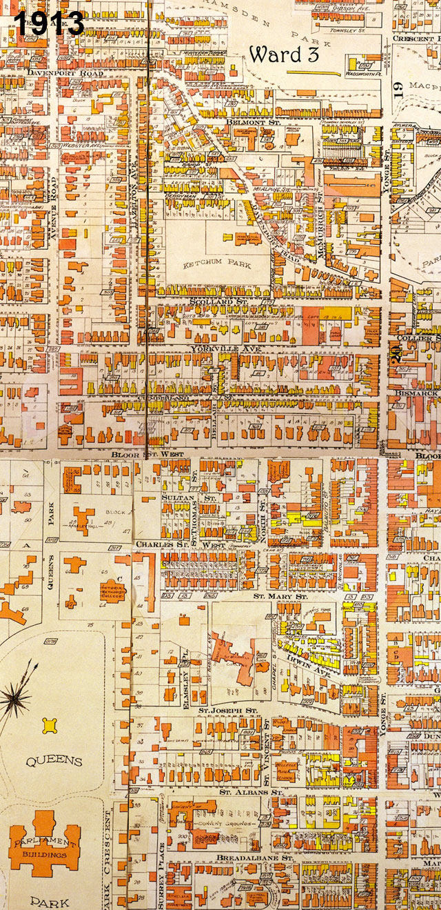
Goad Atlas fire insurance map showing the area between Yonge St and Queen's Park/Avenue Rd from near College St to Davenport Rd in 1913 - move over with mouse to see the same area in 1924 after Bay St was cut through

One of Toronto’s little historical secrets is the mystery of why Bay St does such a large jog at Queen St. History buffs may know the answer, but I only recently came upon it myself, and it answered many questions I’d long had about the strange disconnect in (of all places) Yorkville between Yonge St and the centre of what we now think of as Yorkville, the area west of Bay St.

The jog on Bay St creates one of Toronto’s most spectacular urban design moments, but it was far from deliberately planned that way – the placement of the tower of Old City Hall simply took advantage of a precondition in which Bay St ended at Queen St. What is today Bay St north of Queen St was originally a separate street running between Queen St and College St called Terauley St. Terauley St and the grid north of Queen St were originally laid out as part of a separate estate that did not line up with the grid south of Queen (even University Ave did not originally extend south of Queen St, whereas Yonge St was the exception as it was the original concession road).

North of College St there was a one block break, and then a series of streets with slightly different alignments (called St Vincent St, Chapel St and North St) continued the rough line of Terauley St north to Bloor St. North of Bloor St, no streets crossed through Yorkville along the Terauley St alignment. In the early 1920’s, the City decided to cut the Terauley alignment all the way through from Queen St to Davenport Rd and rename it as an extension of Bay St. The late date of Bay St’s creation north of Queen partly explains the lack of significant historical buildings along the street.

The effect in Yorkville has been more profound, as Bay St essentially split the old village in two. Originally, the centre of Yorkville was clearly along Yonge St (very few commercial buildings even existed at the time along Bloor St). Both the library and the fire hall were located close to Yonge St on Yorkville Ave. Since the 1920’s and the cutting through of Bay St, the fortunes of Yorkville west and east of Bay seem to have gone in different directions. While Yonge St has lost most of its connection to Yorkville and sense of it’s former individuality, Yorkville west of Bay was destined to become a centre for artists and alternative culture and finally a very unique boutique shopping district, maintaining a significant amount of its character and village feeling.
Analyzing Urban Form by Block Shape and Size

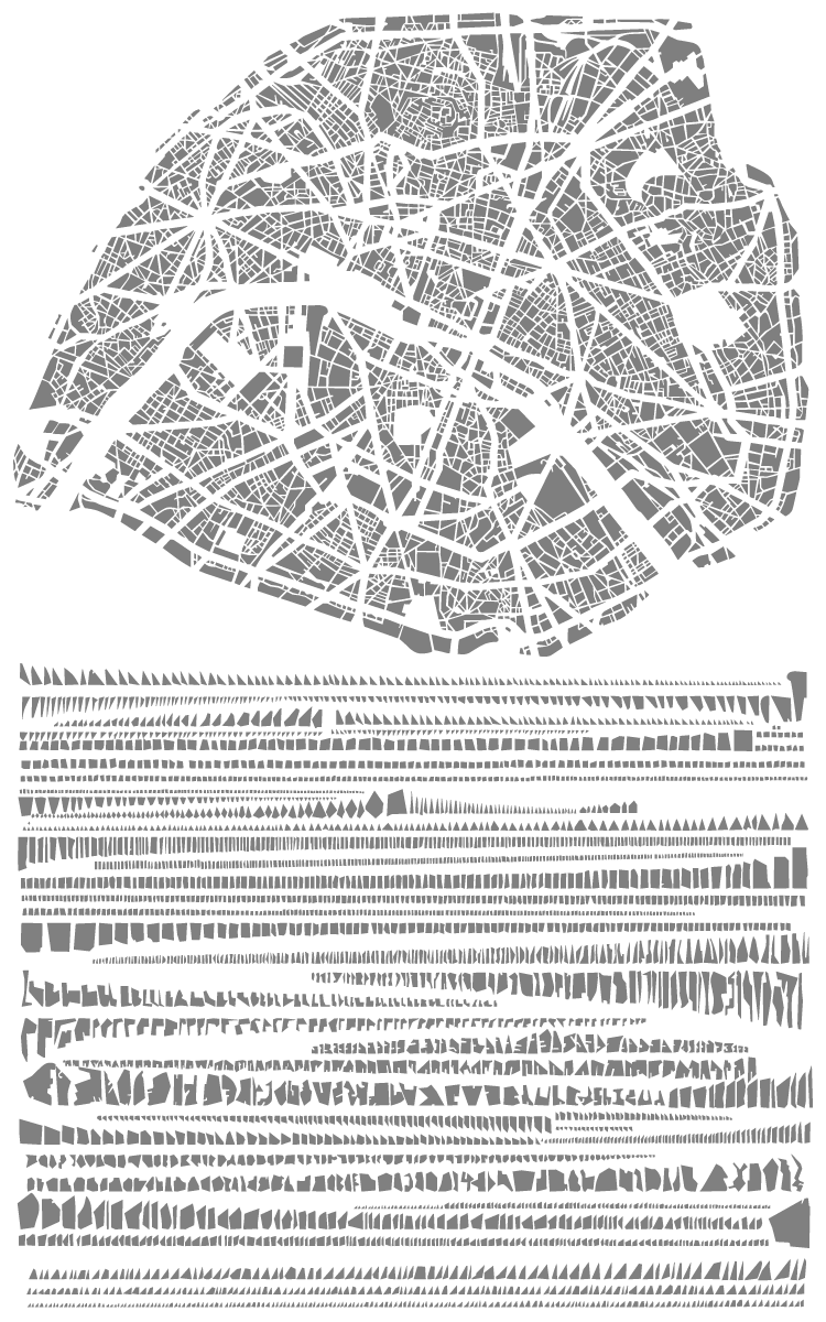
The block pattern of Paris in map form and arranged by shape and size

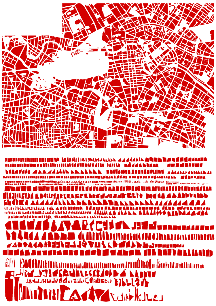
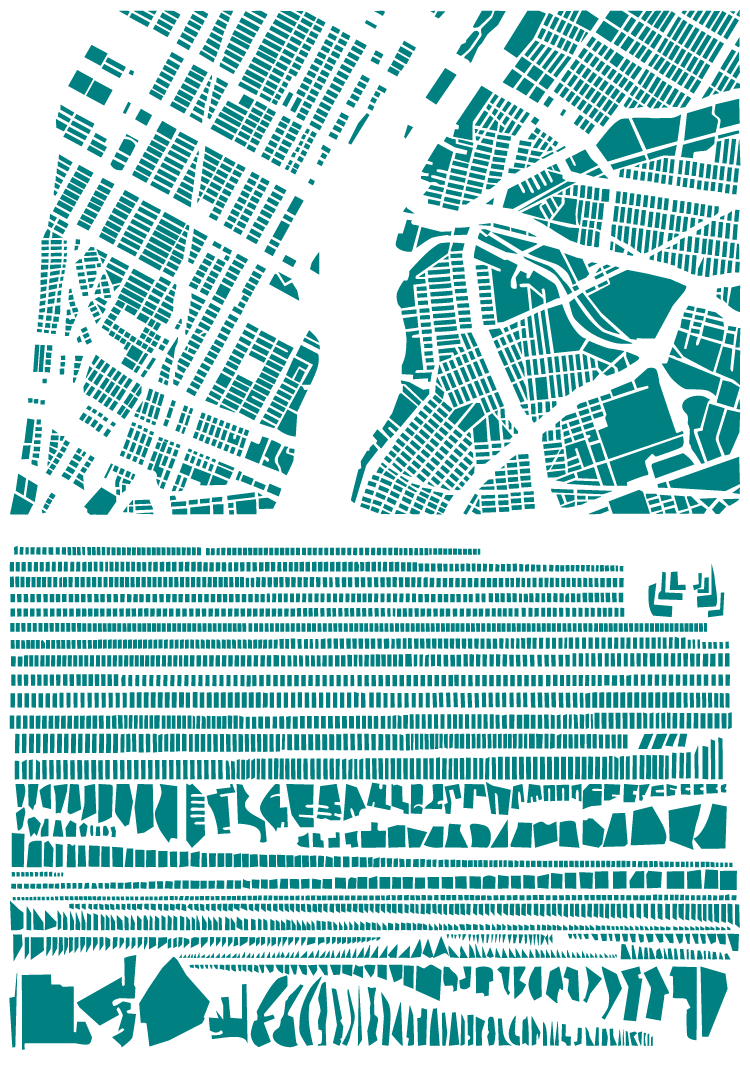
French artist Armelle Caron has created a series called “tout bien rangé” in which the block patterns of various cities have been disassembled, sorted by shape and size and rearranged as a new graphic representation of the city. While the result of the taxonomicalish classification and reorganization is not particularly useful from an urban design perspective (the city maps don’t seem to be at the same scale, for one), it’s certainly an interesting way to look at the city, and to think about blocks, block size and block shape, which are such an integral and enduring element of our cities’ urban forms. See all of the pieces on the artist’s site. (via Strange Maps)

For something similar see The Patterns of the Urban Fabric of Beijing’s Hutong.

The block pattern of New York (part of Manhattan and part of Brooklyn) in map form and arranged by shape and size


The block pattern of central Berlin in map form and arranged by shape and size

Pedestrian Advocacy Gone Wrong

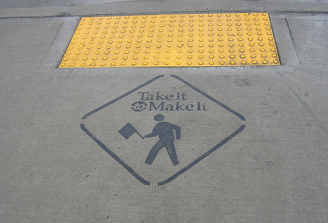
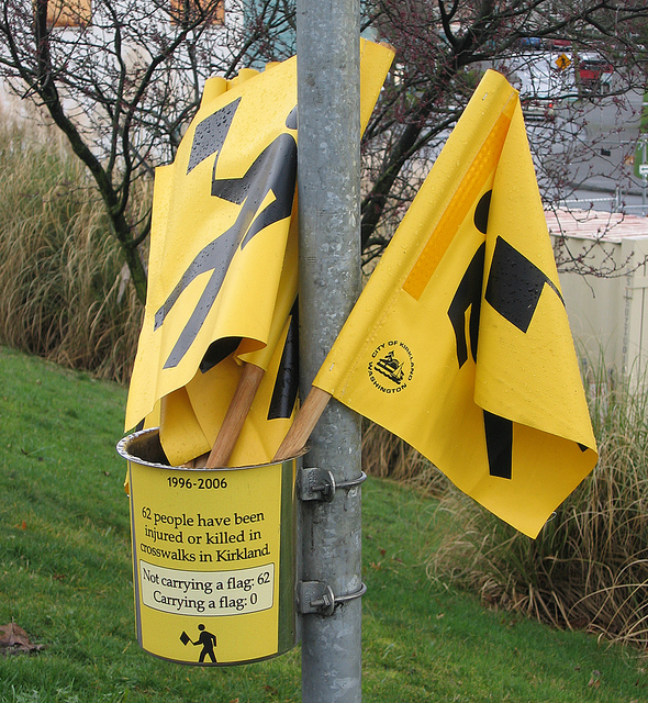
Take it to Make It curb cut, Kirkland, Washington (Photo: EPA Smart Growth)

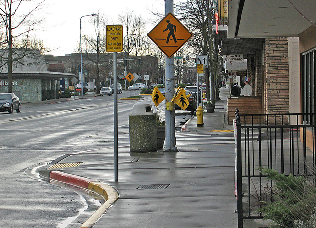
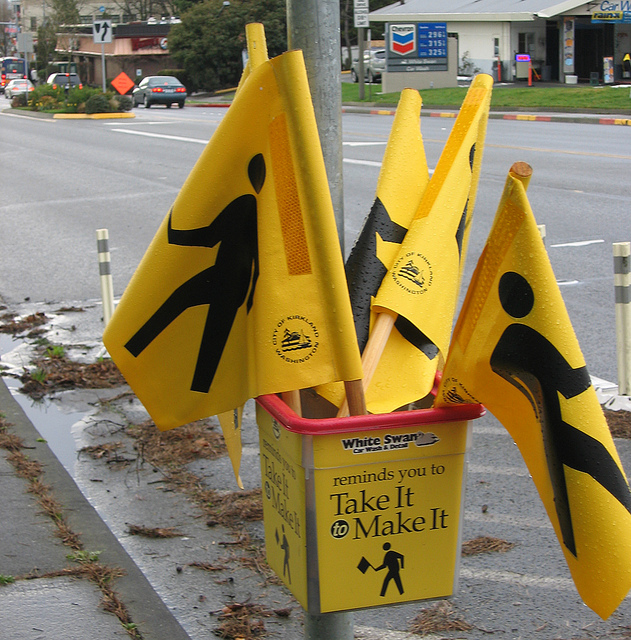
What on earth is going on in this small city (Kirkland, a suburb of Seattle) in Washington State? So much for West Coast cities having a reputation for being progressive: Kirkland has somehow decided that the best way to handle pedestrian injuries and deaths at pedestrian crossings is to place yellow flags at each side of the street for the pedestrians to carry and hold out as they cross the street! What? Yeah, read that again. The name of the campaign? Take it to Make It! As it says on some of the buckets of flags, “62 people have been injured or killed in crosswalks in Kirkland. Not carrying a flag: 62. Carrying a flag: 0.” Errr… what?

Is the implication that somehow a pedestrian who gets hit not carrying a flag is at fault? Or that someone carrying two shopping bags doesn’t deserve to be as safe on a crosswalk as someone with a free hand to hold a flag? Are you kidding me? What is the point of having a crosswalk at all if you’re going to shift all the responsibility for pedestrian safety onto the pedestrian? Do all pedestrians need to wear bright fluorescent vests in order to not be at fault if hit while crossing the street? At least if they wore a vest they wouldn’t have to hold these stupid flags! Is EPA’s Smart Growth program really using this as a good precedent for smart growth?

Take it to Make It pedestrian crossing, Kirkland, Washington (Photo: EPA Smart Growth)

Take it to Make It pedestrian flags, Kirkland, Washington (Photo: EPA Smart Growth)

Take it to Make It pedestrian flags, Kirkland, Washington (Photo: EPA Smart Growth)

Toronto From the Perspective of Flickr and Twitter

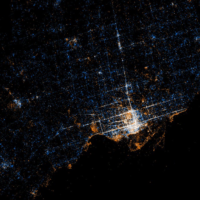
Toronto from the perspective of Flickr and Twitter: Red dots are locations of Flickr pictures. Blue dots are locations of Twitter tweets. White dots are locations that have been posted to both (image: Eric Fischer at Flickr.com). Move over with mouse to see Google Map overlay to locate yourself.

An interesting (and beautiful) set of maps have been made by Flickr user Eric Fischer showing maps of the locations of Flickr photos and Twitter activity in major urban centres around the world (see the full set called “See something or say something” to compare to other cities). What’s interesting is how clearly the downtown street fabric of Toronto (and other cities) is revealed by people’s photos and tweets. While it might seem obvious that the streets (being our main public realm) are the places where the most concentrated activity of this kind takes place, it still suggests things about how people use the city and of what and where they choose to take photos. Outside the core, the main photo concentrations appear to be the waterfront and major parks, with a few splotches at major urban nodes which suggests a large preference for taking photos of the natural environment. Meanwhile the Twitter activity is much more evenly spread across the city, although still concentrated enough around the major streets of the city to give a suggestion of the street network. The clarity with which Yonge St, Bloor/Danforth and Queen St stand out shows just how much activity in general in Toronto is concentrated around these three streets that most of us know are the main spines of the city. If only Queen St had a subway line recognizing this to match the other two!

Image 01

The Subway to Nowhere?

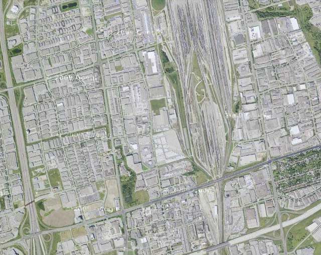
Vaughan north of highway 407 (source: google maps)

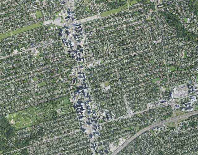
The Spadina subway extension to Vaughan is under construction and scheduled to be open for the end of 2015, but where exactly is this thing going? Sure it goes to York University (which I think most people would accept is a good idea), but there will be a full 2 more stations north of Steeles Ave into Vaughan, so what exactly is up there? See above… Oh dear… It looks like we’re extending a subway line that originally kind of went to nowhere, to another even more extreme nowhere, a vast sea of single-storey warehousing, manufacturing, big box stores and railway lands. But wait! Building a subway will result in massive development right? So this area is ripe for a total makeover, right? Oh wait a minute… here’s the famed subway-driven development along the Yonge St corridor north of highway 401 from Sheppard Ave to north of Finch at the same scale, the result of almost 40 years of development (see below).

Yonge St development corridor north of highway 401 at the same scale (source: google maps)

I guess the even more modest kind of development around the Sheppard Line wouldn’t have much of an effect either (see below).

Sheppard Ave development corridor north of highway 401 at the same scale (source: google maps)

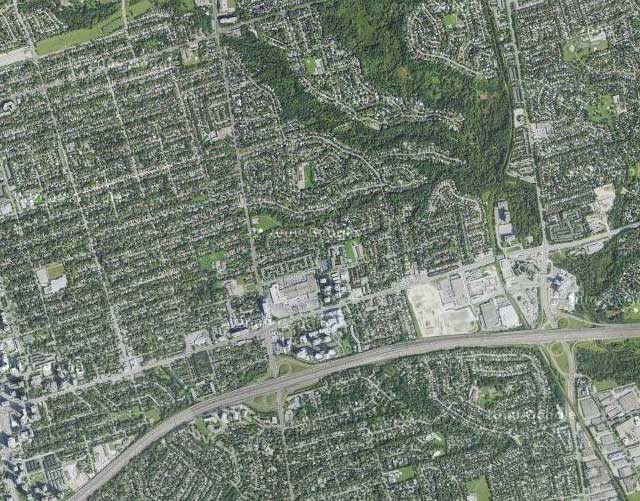
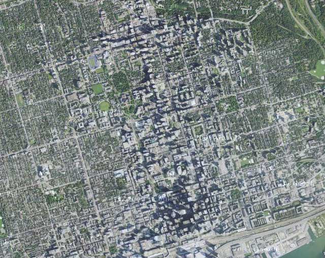
So just how large is this sea of nothingness that we’ve sent a subway line to? Oh, that’s right, as large as the entire downtown core of Toronto (see below). Damn.

Downtown Toronto from the Union Station to Bloor at the same scale (source: google maps)

Beautiful Urban Moments – Part X

403_1090296

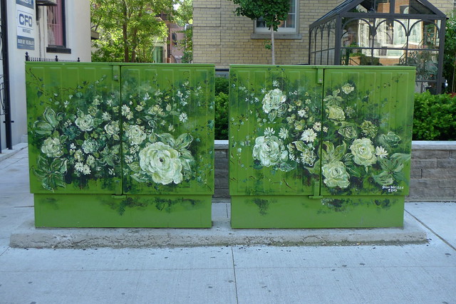
Beautiful flower murals on telephone utility boxes along the north side of Yorkville Ave, east of Hazelton Ave in front of Teatro Verde, Yorkville, Toronto

This is a great example of the creative potential of a simple solution to vastly improve the aesthetics of one of the typically ugly pieces of urban infrastructure, the telephone utility box. While land-line telephones may be on the way out, there’s still plenty of urban infrastructure that could similarly benefit from some creative attention. The mural is by Bruni Nielsen and is in Yorkville, Toronto along the north side of Yorkville Ave, east of Hazelton Ave in front of Teatro Verde.

Tahrir Square, Cairo – From Traffic Circle to Civic Square

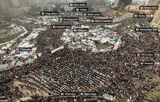
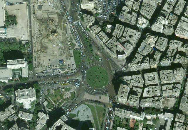
Annotated photo from BBC (over Reuters photo) of Tahrir Square, Cairo at the height of the protests (click through to BBC to read the annotations

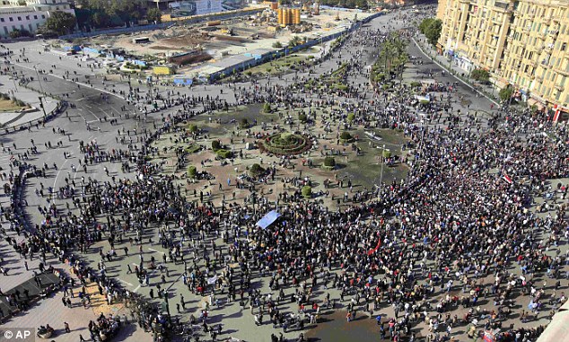
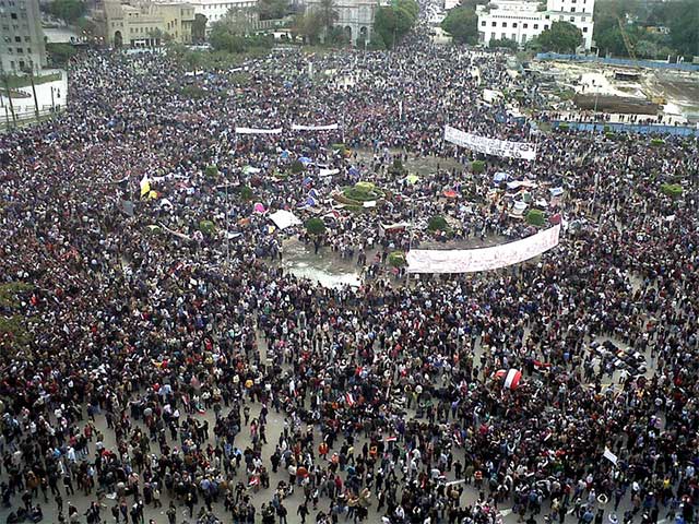
Tahrir Square in central Cairo became the nucleus for unprecedented protests against the government in Egypt in February. While the name Tahrir means Liberation (referring to the Egyptian revolution against British rule in 1919, but subsequently co-opted to also refer to the 1952 military coup that removed the Egyptian monarchy and established the modern Republic), the space itself normally hardly serves as a great civic square, being for all intents and purposes a huge traffic circle.

Tahrir Square area from Google Maps

But it just goes to show that the utility of a civic square lies as much in its imagined symbolic role as in its intended programme and design – the key requirement is largely that the space is simply open. It doesn’t matter if it’s legally accessible, or if the law allows peaceful assembly. In times of crisis or great importance, people will gather in the place that captures the public imagination. After all, traffic is certainly no obstacle to a revolution.

Tahrir Square - Daily Mail (Associate Press) photo

Tahrir Square on Friday of Departure (Feb 4th) by Flickr user Mona Sosh

Crowds in Tarhrir Square (Photo: AP/Tara Todras-Whitehill)

Friday prayers by the Tahrir Square demonstrators, photo by Amr Addullah Dalsh (Reuters via Calgary Herald)

Lujiazui and the “Pudong Miracle” – 20 Years of Transformation

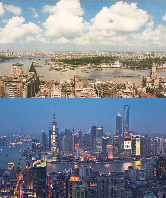
Lujiazui financial district in Pudong seen in 1990 and in 2010 from across the Huangpu River over the Bund in the historic International Settlement area of central Shanghai

The Pudong New Area (浦东新区) in Shanghai was first masterplanned in 1990, at a time when most of Pudong (浦东, named for being east (东) of the Huangpu River (浦), as opposed to Puxi (浦西) west (西) of the river) was factories, warehouses, villages and farmland with typical 1980’s Chinese residential development taking place. At that time Pudong had only 2 road tunnels under the Huangpu River connecting it to the rest of Shanghai and Shanghai’s first metro line had not even started construction. Shanghai’s metro line 2 linking Pudong to central Shanghai would not open until 1999, but by then Pudong was already well on it’s way to representing a model of the dream of highly planned and modern rapid development that China was reaching for.

The Lujiazui (陆家嘴) area in particular had already started to become an icon of the city as Shanghai’s new financial centre, its visibility and image guaranteed by its position directly opposite Shanghai’s historic Bund where the hoards of tourists who came to see Shanghai’s history could also see the city’s future in the forest of towers across the river.

Fast forward to 2010, and Pudong is connected to the rest of Shanghai by four huge bridges and five road tunnels, and serviced by 6 metro lines. The whole thing is a stunning representation of the development of Shanghai (and China) over the last 20 years, years that have changed Shanghai forever.

On the other hand, from an urban design perspective, Pudong can be seen as part of a much larger failure of suburban planning and design in China and around the world. Even in Lujiazui, surrounded by office towers, the enormous roads, distance between buildings and lack of pedestrian scale make a clear (and no doubt intentional) break with the historic city in Puxi, and there is a complete lack of character as a result of what can clearly be recognized as a suburban planning philosophy (with “Chinese characteristics”). This has even produced a cultural split between people who prefer Pudong and people who prefer Puxi, with, in some people’s minds, Puxi representing the past and a lesser quality of life, and Pudong representing the future and the modern lifestyle expected by upwardly mobile people in China these days.

The urban design success of Lujiazui is largely scenic – it is meant to be seen from across the river as a symbol of Shanghai’s rise onto the world stage, and act as a platform to look back at the old city from the heights of the city’s current success. Lujiazui’s intended function as Asia’s preeminent financial centre should have produced one of the great modern urban districts, but the result is still best experienced from across the river while walking along the Bund, Shanghai’s 150 year old international financial centre and one of the great streets of the world.

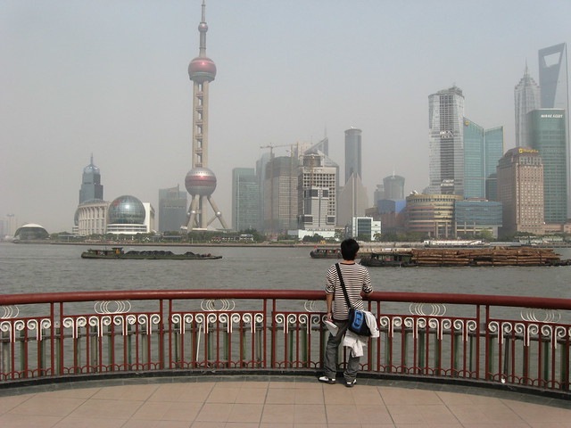
The view from the famous Bund along the Huangpu River, showing Lujiazui and its towers

Source: Before/After image via Reddit

The World According to Facebook

Paul Butler's visualisation of Facebook friendships - click for larger version

Paul Butler, an intern at Facebook put together this data visualisation map of Facebook friendship locality relationships around the world. The glaring black hole of China is due to Facebook being completely blocked there, whereas people in Russia and Brazil prefer other social networking sites, and Africa presumably is dark as a result of relatively low internet usage.

In his own words:

“Visualizing data is like photography. Instead of starting with a blank canvas, you manipulate the lens used to present the data from a certain angle… When the data is the social graph of 500 million people, there are a lot of lenses through which you can view it. One that piqued my curiosity was the locality of friendship. I was interested in seeing how geography and political borders affected where people lived relative to their friends. I wanted a visualization that would show which cities had a lot of friendships between them.”

For more info on exactly what he did and how (and source). Via.

The Patterns of the Urban Fabric of Beijing’s Hutong

370 of the 1500 patterns of the urban fabric of Beijing's hutong from Instant Hutong's Community Catalogue 2007

Part of Instant Hutong’s Community Catalogue 2007, a catalog of hutong block patterns laid out as a “series of 1500 communities of courtyard houses cut out and isolated from the map of downtown Beijing”.

Via Ministry of Type, image sourced from Instant Hutong’s portfolio on the Behance Network