A plea for subtle signage
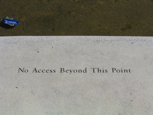
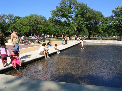
Just back from Houston, a city which, despite its problems, has some fine moments and some beautifully detailed parks and streetscapes. This stepped edge of a pond in Hermann Park simply uses subtle carved words to ask people not to enter the water. In case you think people should be allowed in the water, there was an area for that too!
Too often, it’s easy to forget how signs (particularly restrictive ones) can clutter and dominate public places. While there’s plenty of place for sign clutter on heterogenous and chaotic streetscapes, their intrusion into more passive and contemplative spaces can seem offensive and misplaced.
Hermann Park, re-masterplanned with design projects ongoing by landscape architects Hanna/Olin (now Olin Partnership) and SWA Group (including Keiji Asakura, now of Houston-based Asakura Robinson) and funded by a non-profit group, is a stand-out example of quality urban park refurbishment that practices restraint and holds the line against the commercialisation of public space.


No Comments so far
Leave a comment
Leave a comment
Line and paragraph breaks automatic, e-mail address never displayed, HTML allowed:
<a href="" title=""> <abbr title=""> <acronym title=""> <b> <blockquote cite=""> <cite> <code> <del datetime=""> <em> <i> <q cite=""> <s> <strike> <strong>