urbanism – landscape – ideas – theory – whimsy

Before Bay St Divided Yorkville

Goad Atlas fire insurance map showing the area between Yonge St and Queen's Park/Avenue Rd from near College St to Davenport Rd in 1913 - move over with mouse to see the same area in 1924 after Bay St was cut through

One of Toronto’s little historical secrets is the mystery of why Bay St does such a large jog at Queen St. History buffs may know the answer, but I only recently came upon it myself, and it answered many questions I’d long had about the strange disconnect in (of all places) Yorkville between Yonge St and the centre of what we now think of as Yorkville, the area west of Bay St.

The jog on Bay St creates one of Toronto’s most spectacular urban design moments, but it was far from deliberately planned that way – the placement of the tower of Old City Hall simply took advantage of a precondition in which Bay St ended at Queen St. What is today Bay St north of Queen St was originally a separate street running between Queen St and College St called Terauley St. Terauley St and the grid north of Queen St were originally laid out as part of a separate estate that did not line up with the grid south of Queen (even University Ave did not originally extend south of Queen St, whereas Yonge St was the exception as it was the original concession road).

North of College St there was a one block break, and then a series of streets with slightly different alignments (called St Vincent St, Chapel St and North St) continued the rough line of Terauley St north to Bloor St. North of Bloor St, no streets crossed through Yorkville along the Terauley St alignment. In the early 1920’s, the City decided to cut the Terauley alignment all the way through from Queen St to Davenport Rd and rename it as an extension of Bay St. The late date of Bay St’s creation north of Queen partly explains the lack of significant historical buildings along the street.

The effect in Yorkville has been more profound, as Bay St essentially split the old village in two. Originally, the centre of Yorkville was clearly along Yonge St (very few commercial buildings even existed at the time along Bloor St). Both the library and the fire hall were located close to Yonge St on Yorkville Ave. Since the 1920’s and the cutting through of Bay St, the fortunes of Yorkville west and east of Bay seem to have gone in different directions. While Yonge St has lost most of its connection to Yorkville and sense of it’s former individuality, Yorkville west of Bay was destined to become a centre for artists and alternative culture and finally a very unique boutique shopping district, maintaining a significant amount of its character and village feeling.

Analyzing Urban Form by Block Shape and Size

The block pattern of Paris in map form and arranged by shape and size

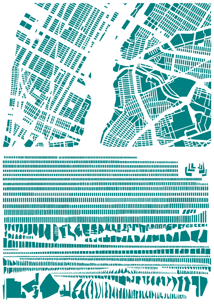
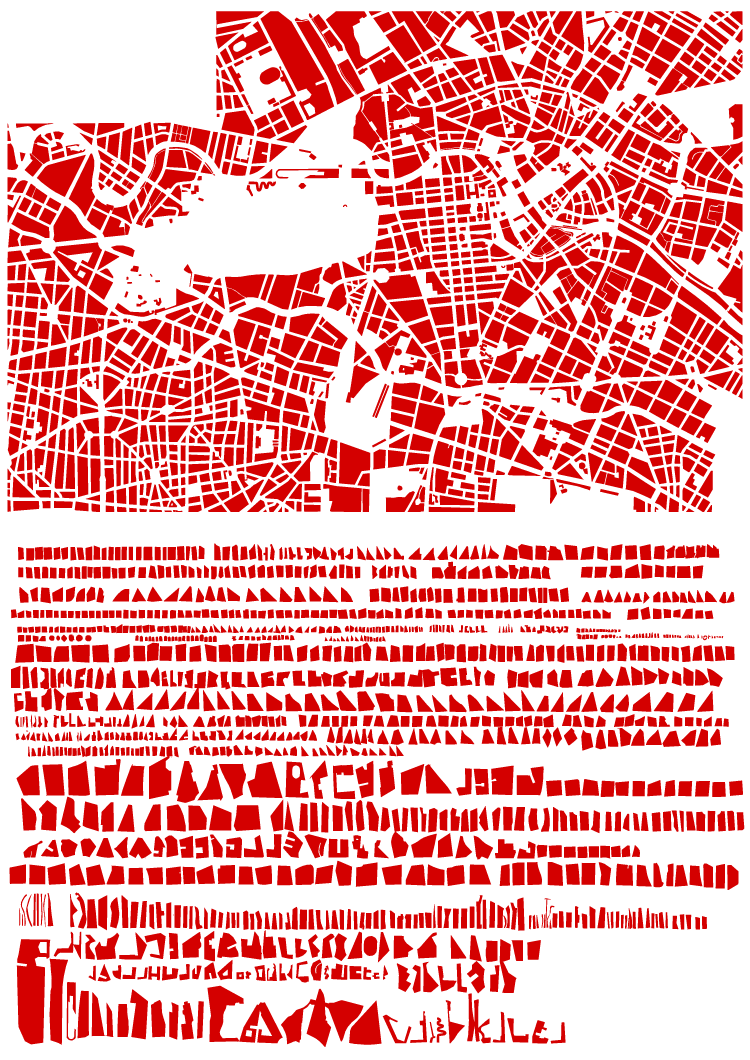
French artist Armelle Caron has created a series called “tout bien rangé” in which the block patterns of various cities have been disassembled, sorted by shape and size and rearranged as a new graphic representation of the city. While the result of the taxonomicalish classification and reorganization is not particularly useful from an urban design perspective (the city maps don’t seem to be at the same scale, for one), it’s certainly an interesting way to look at the city, and to think about blocks, block size and block shape, which are such an integral and enduring element of our cities’ urban forms. See all of the pieces on the artist’s site. (via Strange Maps)

For something similar see The Patterns of the Urban Fabric of Beijing’s Hutong.

The block pattern of New York (part of Manhattan and part of Brooklyn) in map form and arranged by shape and size


The block pattern of central Berlin in map form and arranged by shape and size

Toronto From the Perspective of Flickr and Twitter

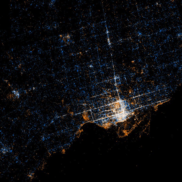
Toronto from the perspective of Flickr and Twitter: Red dots are locations of Flickr pictures. Blue dots are locations of Twitter tweets. White dots are locations that have been posted to both (image: Eric Fischer at Flickr.com). Move over with mouse to see Google Map overlay to locate yourself.

An interesting (and beautiful) set of maps have been made by Flickr user Eric Fischer showing maps of the locations of Flickr photos and Twitter activity in major urban centres around the world (see the full set called “See something or say something” to compare to other cities). What’s interesting is how clearly the downtown street fabric of Toronto (and other cities) is revealed by people’s photos and tweets. While it might seem obvious that the streets (being our main public realm) are the places where the most concentrated activity of this kind takes place, it still suggests things about how people use the city and of what and where they choose to take photos. Outside the core, the main photo concentrations appear to be the waterfront and major parks, with a few splotches at major urban nodes which suggests a large preference for taking photos of the natural environment. Meanwhile the Twitter activity is much more evenly spread across the city, although still concentrated enough around the major streets of the city to give a suggestion of the street network. The clarity with which Yonge St, Bloor/Danforth and Queen St stand out shows just how much activity in general in Toronto is concentrated around these three streets that most of us know are the main spines of the city. If only Queen St had a subway line recognizing this to match the other two!

Image 01

Tahrir Square, Cairo – From Traffic Circle to Civic Square

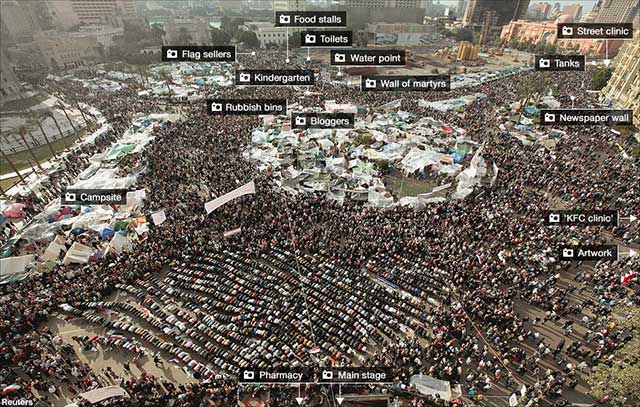
Annotated photo from BBC (over Reuters photo) of Tahrir Square, Cairo at the height of the protests (click through to BBC to read the annotations

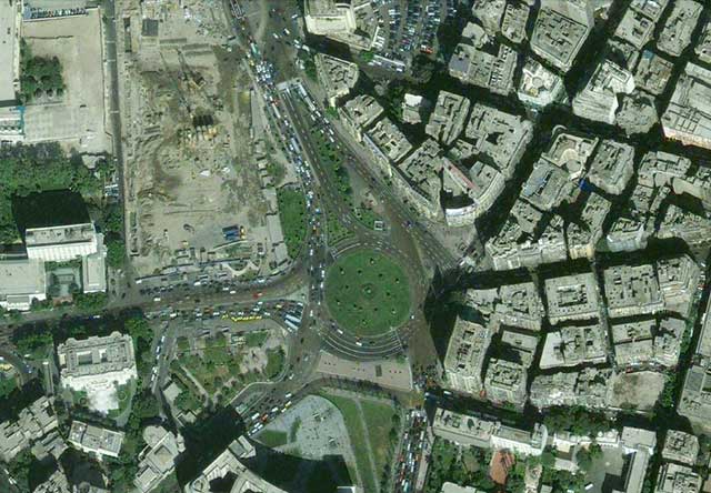
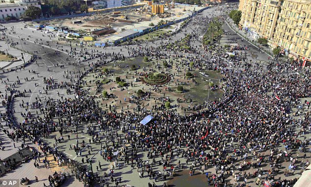
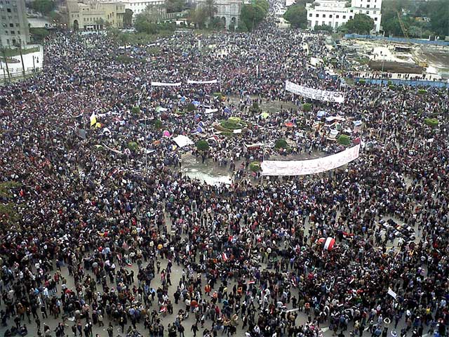
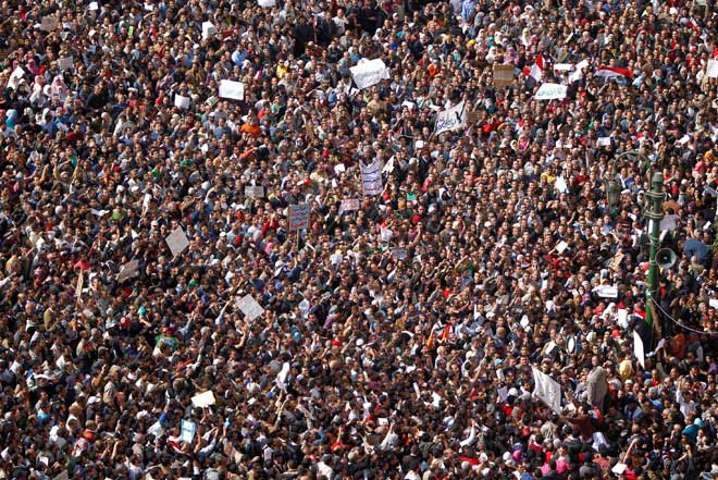
Tahrir Square in central Cairo became the nucleus for unprecedented protests against the government in Egypt in February. While the name Tahrir means Liberation (referring to the Egyptian revolution against British rule in 1919, but subsequently co-opted to also refer to the 1952 military coup that removed the Egyptian monarchy and established the modern Republic), the space itself normally hardly serves as a great civic square, being for all intents and purposes a huge traffic circle.

Tahrir Square area from Google Maps

But it just goes to show that the utility of a civic square lies as much in its imagined symbolic role as in its intended programme and design – the key requirement is largely that the space is simply open. It doesn’t matter if it’s legally accessible, or if the law allows peaceful assembly. In times of crisis or great importance, people will gather in the place that captures the public imagination. After all, traffic is certainly no obstacle to a revolution.

Tahrir Square - Daily Mail (Associate Press) photo

Tahrir Square on Friday of Departure (Feb 4th) by Flickr user Mona Sosh

Crowds in Tarhrir Square (Photo: AP/Tara Todras-Whitehill)

Friday prayers by the Tahrir Square demonstrators, photo by Amr Addullah Dalsh (Reuters via Calgary Herald)

Lujiazui and the “Pudong Miracle” – 20 Years of Transformation

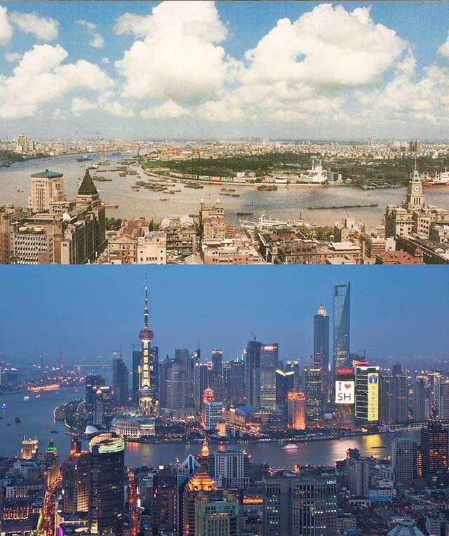
Lujiazui financial district in Pudong seen in 1990 and in 2010 from across the Huangpu River over the Bund in the historic International Settlement area of central Shanghai

The Pudong New Area (浦东新区) in Shanghai was first masterplanned in 1990, at a time when most of Pudong (浦东, named for being east (东) of the Huangpu River (浦), as opposed to Puxi (浦西) west (西) of the river) was factories, warehouses, villages and farmland with typical 1980’s Chinese residential development taking place. At that time Pudong had only 2 road tunnels under the Huangpu River connecting it to the rest of Shanghai and Shanghai’s first metro line had not even started construction. Shanghai’s metro line 2 linking Pudong to central Shanghai would not open until 1999, but by then Pudong was already well on it’s way to representing a model of the dream of highly planned and modern rapid development that China was reaching for.

The Lujiazui (陆家嘴) area in particular had already started to become an icon of the city as Shanghai’s new financial centre, its visibility and image guaranteed by its position directly opposite Shanghai’s historic Bund where the hoards of tourists who came to see Shanghai’s history could also see the city’s future in the forest of towers across the river.

Fast forward to 2010, and Pudong is connected to the rest of Shanghai by four huge bridges and five road tunnels, and serviced by 6 metro lines. The whole thing is a stunning representation of the development of Shanghai (and China) over the last 20 years, years that have changed Shanghai forever.

On the other hand, from an urban design perspective, Pudong can be seen as part of a much larger failure of suburban planning and design in China and around the world. Even in Lujiazui, surrounded by office towers, the enormous roads, distance between buildings and lack of pedestrian scale make a clear (and no doubt intentional) break with the historic city in Puxi, and there is a complete lack of character as a result of what can clearly be recognized as a suburban planning philosophy (with “Chinese characteristics”). This has even produced a cultural split between people who prefer Pudong and people who prefer Puxi, with, in some people’s minds, Puxi representing the past and a lesser quality of life, and Pudong representing the future and the modern lifestyle expected by upwardly mobile people in China these days.

The urban design success of Lujiazui is largely scenic – it is meant to be seen from across the river as a symbol of Shanghai’s rise onto the world stage, and act as a platform to look back at the old city from the heights of the city’s current success. Lujiazui’s intended function as Asia’s preeminent financial centre should have produced one of the great modern urban districts, but the result is still best experienced from across the river while walking along the Bund, Shanghai’s 150 year old international financial centre and one of the great streets of the world.

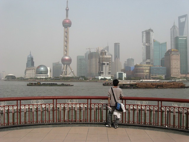
The view from the famous Bund along the Huangpu River, showing Lujiazui and its towers

Source: Before/After image via Reddit

The Patterns of the Urban Fabric of Beijing’s Hutong

370 of the 1500 patterns of the urban fabric of Beijing's hutong from Instant Hutong's Community Catalogue 2007

Part of Instant Hutong’s Community Catalogue 2007, a catalog of hutong block patterns laid out as a “series of 1500 communities of courtyard houses cut out and isolated from the map of downtown Beijing”.

Via Ministry of Type, image sourced from Instant Hutong’s portfolio on the Behance Network

Deconstructing the Shanghai Expo – Part III: The Size

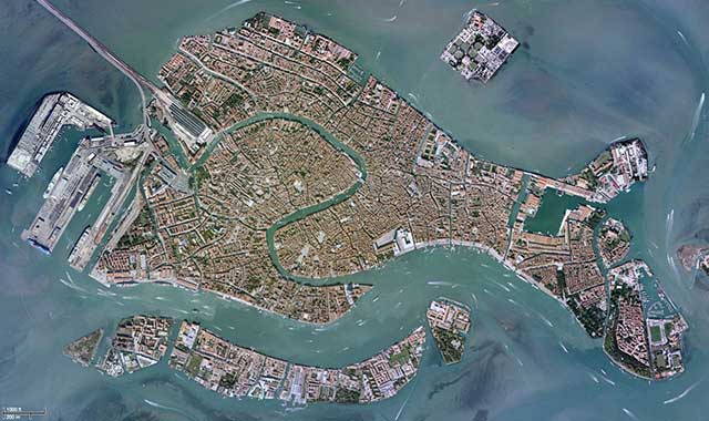
Google Maps satellite imagery of Venice (move over with mouse to compare to outline of Shanghai's Expo at same scale, rotated to best fit and reducing distance across Huangpu River)

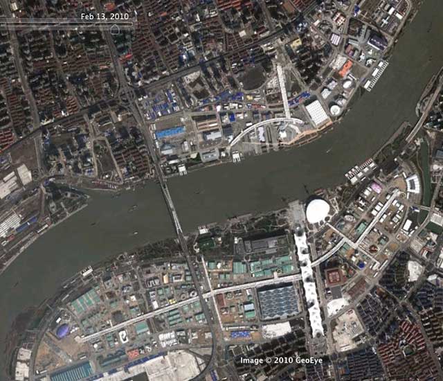
Just how big was Shanghai’s Expo? A constant refrain from anyone visiting was how tiring the whole thing was as a result of how much walking was required (of course the heat didn’t help). Officially the Expo was 528 hectares (or just over 5 square kilometres), but how big is that? A neat comparison is with another contained place around which you mostly have to walk, Venice. The main central islands of Venice (above) are about 540 hectares (not including the port facilities at left), almost the same size as the Expo site! The Expo outline used above (traced from Google Earth) turned out smaller than the official site size (c. 400 hectares instead) but the sizes still seem comparable.

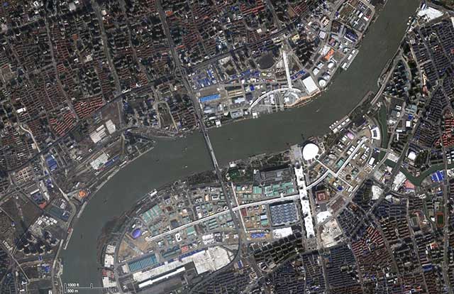
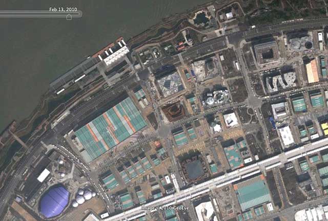
Google Maps satellite imagery of the Shanghai Expo site early in 2010 (move over with mouse to compare to outline of Venice's main islands at same scale, rotated to best fit)

More shocking than the size itself, is the comparison of how much city fabric of Venice’s type can fit in the same area of the Expo site, revealing just how massive the Expo buildings were (are).

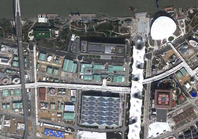
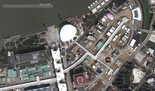
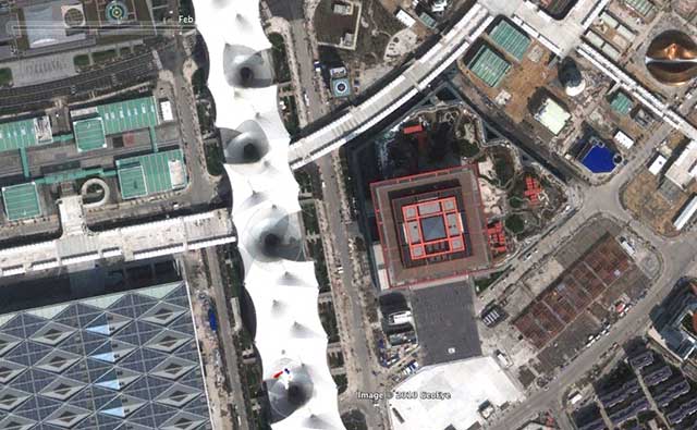
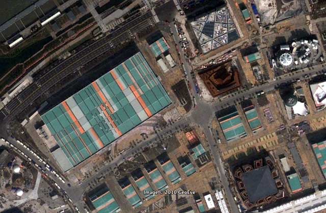
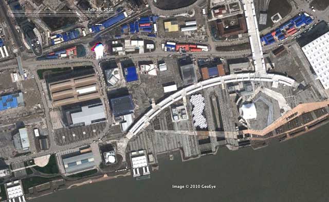
Detail of Main Axis and China Pavilion area - Google Maps satellite imagery of the Expo site early in 2010 (move over with mouse to compare to Venice's urban fabric at the same scale)

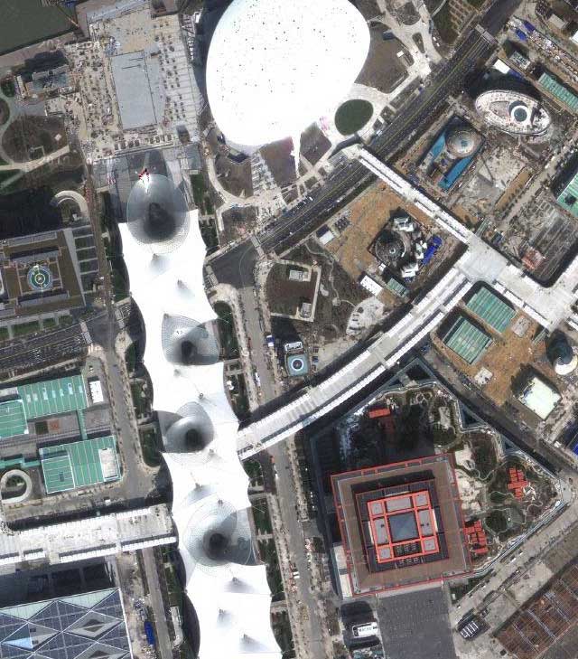
More detail of Main Axis and China Pavilion area - Google Maps satellite imagery of the Expo site early in 2010 (move over with mouse to compare to Venice's urban fabric at the same scale)

If you haven’t seen them, don’t forget to check out Part I of Deconstructing the Expo: By The Numbers , and Part II: The Effacement

Image 01Image 01Image 01Image 01

Deconstructing the Shanghai Expo – Part II: The Effacement

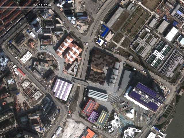
Google Earth imagery of the Expo site early in 2010 (move over with mouse to compare to May, 2004)

Before anyone gets too teary-eyed about the impending disappearance of most of Shanghai’s Expo 2010, they should spare a thought for what was there before the enormous 528 hectare site was largely wiped clean in readying the tabula rasa for all that cloying architectural play-time.

Despite the amount of greenwash that got thrown around, it hardly seems like the most sustainable thing in the world to wipe clean over 5 square kilometers of city for a 6 month event, and then have to start wiping most of it clean again. And as for so-called Urban Best Practices, the minimal amount of industrial heritage that was preserved hardly measures up to even the standards set by many adaptively-reused creative districts in Shanghai itself, let alone in so many other cities around the world.

Of course, the result will be the perfectly-sized (ie. huge), empty lots ready for high-density redevelopment that modern Chinese urbanism revolves around – not much new there.

We also shouldn’t forget the 18,000 households that were moved off the site to new housing elsewhere, although domestic media worked hard to remind us how much better and more wonderful all those people’s lives are now, thanks to the Expo!

Continue below to zoom in at some more detailed areas of the Expo site – Google hasn’t perfectly lined up the two sets of satellite imagery but they’re close enough.

Detail of Main Axis and China Pavilion - Google Earth imagery of the Expo site early in 2010 (move over with mouse to compare to May, 2004)

More detail of Main Axis and China Pavilion - Google Earth imagery of the Expo site early in 2010 (move over with mouse to compare to May, 2004)

Detail of west end (Zone C) with European and African pavilions - Google Earth imagery of the Expo site early in 2010 (move over with mouse to compare to May, 2004)

Whoa there – that looks like a village, still thriving in the centre of Shanghai in 2004! Those even look like fields or market gardens! Isn’t that the kind of thing that designers are constantly proposing for the sustainable future, and here it was, sadly wiped away by the Expo. And what an interesting pattern it had… of course that had to be wiped away too, to be replaced by the giant big box of the Africa Joint Pavilion… oh well!

More detail of west end (Zone C) with European and African pavilions - Google Earth imagery of the Expo site early in 2010 (move over with mouse to compare to May, 2004)

Detail of the Corporate pavilion area in Zone D - Google Earth imagery of the Expo site early in 2010 (move over with mouse to compare to May, 2004)

Detail of the Urban Best Practices Area in Zone E - Google Earth imagery of the Expo site early in 2010 (move over with mouse to compare to May, 2004)

In the Urban Best Practices Area you can see the most preserved buildings (albeit most of them heavily altered), but you can still see how fundamentally the pattern and texture of the fabric was altered for the purposes of the Expo.

If you haven’t seen it, don’t forget to check out Part I of Deconstructing the Expo: By The Numbers

Image 01Image 01Image 01Image 01Image 01Image 01Image 01

Progress of Demolition of Kashgar

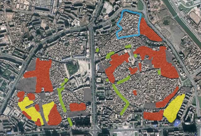
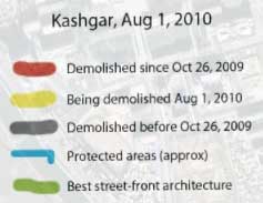
Google Earth mapping of demolition of Kashgar by Stefan Geens (ogleearth.com), click for larger version

Last year warnings were raised around the world about the impending demolition of most of the ancient old quarter of Kashgar, a key city along the fabled Silk Road caravan route between west and east, located in China’s Xinjiang province (aka Uyghur Autonomous Region) near the westernmost border of China. Before demolition started, the city was considered “the best-preserved example of a traditional Islamic city to be found anywhere in central Asia.” The government plans to demolish 85% of the old town, replacing the old buildings and fabric with modern housing and development “in local style”, ostensibly to improve the local economy and living standards of residents, and ensuring housing can withstand an earthquake, though whether those are just convenient excuses is subject to a lot of discussion that I’d rather not get into. Stefan Geen (of “neogeo” website ogleearth.com) made a trip to Kashgar in late July 2010 and thoroughly documented the extent of demolition as of August 1, 2010 in Google Earth and on his website, and extensively photographed what remains and the people he met there, all mapped and located in his KMZ file for Google Earth (which you should check out for full interactivity). Above is his map of what has been demolished, and what was in the process of being demolished while he was there, as well as showing the small area that will be preserved for your typical Chinese tourist trap.

While the overall effect so far from the air perhaps doesn’t seem as shocking as the demolition of Tianjin’s old town I wrote about earlier (without more uptodate airphotos, the destruction is not yet obvious, the base is the latest Google Earth has, from October 26, 2009), the damage to the cultural heritage and tourism prospects of Kashgar will certainly be far, far worse once demolition is completed. It is frankly shocking that Kashgar was not made a UNESCO World Heritage Site, something that would have certainly at least preserved the physical character of the old town, and is an incredibly popular route for Chinese heritage tourism spots these days (China has the 3rd highest number of World Heritage Sites in the world, and growing). Of course, the country itself has to nominate the place to become designated a World Heritage Site, which likely explains why Kashgar has never been designated. While being designated is not some kind of magical panacea of preservation (leading as it almost inevitably does to massive tourism and the changes of ownership, character and development that brings with it), the degree of preservation that does occur, whether through international or financial pressures from UNESCO, can be gauged by the fact that only 2 World Heritage sites have ever been delisted for destroying the character that led to designation.

In any case, I was hoping to make it to Kashgar to experience its unique ancient character before demolition, but not sure I’ll make it now (the disturbances in Xinjiang last year didn’t help). Actually, I just came back from Shangri-La (or at least, the self-named Shangri-La which is not the same thing at all, with a stop in Lijiang, another World Heritage Site), which ironically, despite the name, is a far cry from the unique, isolated kind of place that I imagine Kashgar is (or is that was?).

Image 01

Shanghai’s Metro and London’s Tube Head to Head

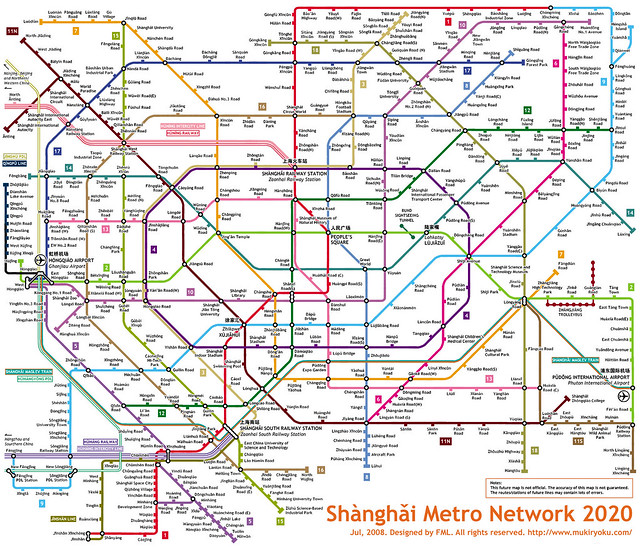
Shanghai Metro Network 2020

Shanghai Metro Network in 2020 in style of the famous London Tube diagram, by Flickr user Kzaral

Now that Shanghai’s Metro is officially the longest subway network in the world (by track length), I thought it would be interesting to do a comparison between it and the long-time title holder that it displaced, London’s Underground.

The first major difference is that Shanghai’s Metro is still expanding, very fast. By 2020 it intends to have added over 350km in new lines and extensions, almost doubling its network length, and in China, when the government intends to achieve something within a 10 year timeframe, they generally succeed or come close. With currently 420km of network, Shanghai’s Metro earlier this year passed the Underground (which has 402km, although I believe that doesn’t include the Overground line or the Docklands Light Railway) after opening 3 new lines and long extensions to 2 other lines (creating a subway link between the city’s two airports) in time for the opening of the Shanghai Expo. The shocking thing about the 2020 expansion plan is that it will make the above diagram (created by Kzaral aka FML in the style of the famous Tube map) a reality and not a fantasy. All this from a system that only opened its first subway line (appropriately called Line 1) in 1995. Yes, you read that right, 1995.

The second major difference is that there is no suburban commuter rail system in Shanghai that compares with those in cities like London, Paris and Tokyo, where the railway network is essentially operated as a secondary rapid transit system with longer station intervals than the subway, generally with an interchangeable fare system. In Shanghai there is only the regular railway network which is not run anything like a metro rapid transit system, but clearly prioritizes long-distance and high-speed trains, and largely services only 2 stations within the inner city, the main station and the south station. This is a severe deficiency in a city as large as Shanghai since it is those suburban commuter rail systems that ensure quick and efficient travel into the city centre from the suburbs, and in Shanghai make no mistake, those suburbs are often nearly as high density as the inner city. This is the reason that even with what seems on the surface like a fully implemented subway system, Shanghai actually desperately needs to push ahead with the rest of the subway system expansion program, because most of the new lines and track length will be servicing the vast suburban areas in an attempt to make up for this lack of a commuter rail network. Time will tell whether this model actually services the suburbs with better all-round transit than the commuter rail approach, and at least Shanghai has the density to justify subways in the suburbs. However, as of now, the subway model predetermines extremely long subway rides from the suburbs rather than quicker commuter trains that stop less frequently and dump you in the city centre to jump on the subway to your destination. In contrast to the London commuter rail paradox of someone living in a rural village outside the city potentially having a significantly shorter commute than someone living in the inner city itself, in Shanghai the emerging paradox (fueled by extensive high-speed rail expansion) is someone living in a city 300km away from Shanghai (eg Nanjing) having a shorter commute than someone living in Shanghai’s suburbs (the new Shanghai-Nanjing train can do the 300km trip in 73 minutes).
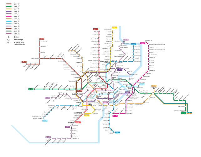
Full current regional network diagram of Shanghai Metro, July 2010, move over with mouse to show 2020 expansion (credit: Shanghai Daily)
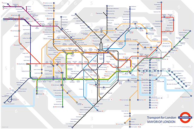
Full regional network diagram of London Underground (including Overground and Docklands Light railway) (credit: TfL)

The Shanghai network map is quite a bit less diagrammatic than the iconic Tube map, but a comparison reveals the different biases of each system. In particular, the primary strength of the London Underground has always been in movement around inner London’s central areas for which the coverage is excellent. This bias is highly demonstrated in the famous Beck Tube map in the extremely large size of Zones 1 and 2 compared to the suburban zones, although this was no doubt to allow clear reading of the closely spaced stations and line layouts. In Shanghai’s case the emphasis is clearly on the radial pattern of suburban lines rather than the central area, and this will only increase with the future expansion plans. In particular, notice in the two maps that Shanghai’s circular Line 4 (the purple irregular circle) and London’s Circle Line (yellow) appear about the same size in the two diagrams, but Line 4 encloses an area 3.6 times bigger than the Circle Line (62.9km2 vs 17.5km2, by my measurements).
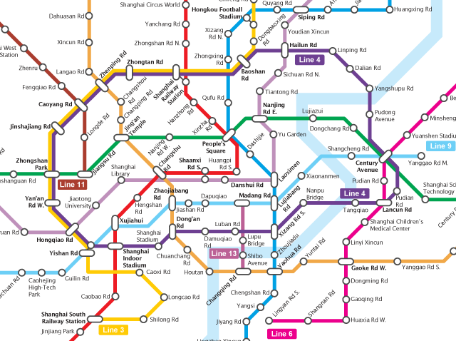
Central area diagram of Shanghai Metro, July 2010, move over with mouse to show 2020 expansion (credit: Shanghai Daily)
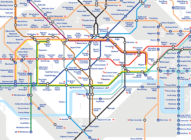
Central area diagram of London Underground (including Overground and Docklands Light railway) (credit: TfL)

Now perhaps Shanghai’s central area is larger than London’s thus justifying a larger scale for the circular line, or perhaps Line 4 shouldn’t be used to compare either its function or service area with the Circle Line. Unfortunately, this is where the diagram maps start to fail us, because it becomes hard to understand whether there’s a significant difference in service quality or convenience as a result of this difference in scale. For that we need a geographically accurate representation of both systems that we can look at and measure at the same scale. So here we are:
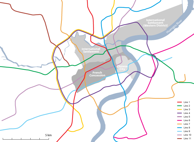
Central area of Shanghai Metro, July 2010 (geographically accurate, showing historic city centre districts)
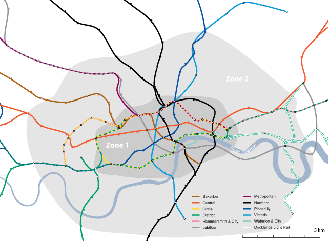
Central area of London Underground (geographically accurate, not including Overground and railway network), move over with mouse to show major parks of central London

What is most noticeable right away is that London’s Circle Line falls entirely inside the Underground’s Zone 1 which can easily be taken to represent central London, although anyone who knows London will know that quite a few districts considered “central” fall inside Zone 2 instead. Additionally, the London Congestion Zone (which could also easily by used as a boundary for central London) largely mimics Zone 1 with a few variations but enclosing an area of the same size. This means that the Circle Line directly services numerous important destinations right within central London, while it’s tracks are shared with 3 other lines over different parts of the route meaning every station on the Circle Line allows transfers to a different line. There are additionally 18 railway stations and termini within the Underground’s Zone 1, 6 of them directly serviced by the Circle Line, allowing direct connections for commuter rail passengers.

For the Shanghai map I have included historic districts of the city which include the Old Chinese City and its port district along the Huangpu River, the French Concession and the International Concession. Note how Line 4 essentially entirely runs outside the central historic districts. In fact the large Western District area of the International Settlement was the least developed part of all the historic districts, and remains a rather distant feeling part of the city. Strangely, Line 4 also avoids directly servicing Shanghai’s new financial centre at Lujiazui in Pudong on the east bank of the Huangpu River, although it does service Shanghai’s main railway station, although this station itself falls outside of the historic core of the city. The route of Line 4 seems to have largely been decided by the convenience of using old railway right-of-ways and the construction of Shanghai’s Inner Ring Road rather than determining what would best service the city’s future transportation needs.

In general, central Shanghai today is often considered to be anything within the Inner Ring Road, but this definition does not relate to the historic city in any way (particularly on the Pudong/eastern side), while functionally it might relate to the modern reality. I calculated that the old districts of Shanghai I included on the map above cover about 38km2 which funnily enough is around the same size as London Underground’s Zone 1, but nevertheless Line 4 is far bigger than these historic districts, and also misses other new centres at the edge of the historic districts such as Xujiahui and Lujiazui. The real implication of this comes when you examine numbers of stations: London’s Circle Line has 27 stations over 21km around the circle (all of them with an available interchange to at least one line, and many of them directly servicing major destinations), while Shanghai’s Line 4 has 26 stations over 33.7km with interchanges at 16 stations and servicing relatively few major destinations. All together there are 64 Underground stations in London’s Zone 1, but only 34 within Shanghai’s Line 4 (not including Line 4 stations themselves, since I consider them to be outside the city centre), even though London’s Zone 1 (at 38km2) is almost half the size of the area inside Line 4 (62.9km2).
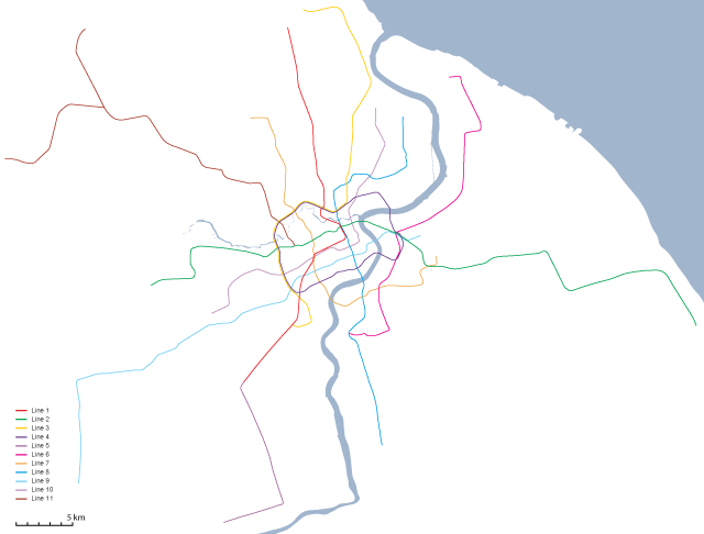
Full current regional network of Shanghai Metro, July 2010 (geographically accurate)
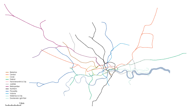
Full regional network of London Underground (geographically accurate, not including Overground and commuter railway network)

Now of course in terms of urbanism, Shanghai and London are very difficult cities to compare, so it may not be fair to dismiss the route of Shanghai’s Line 4 as inappropriate and inconvenient compared to London’s Circle Line. It’s certainly true that central Shanghai is not and will not be served as well by its Metro as central London is by the Underground, but in many ways this reflects the evolving functional reality of Shanghai and the decreasing importance of the historic districts in the future development of the city, largely resulting from the budding desire to protect the historic heritage in the inner districts. But given the densities of suburban Shanghai and the far lower car ownership rates and the lack of commuter rail options, Shanghai does desperately need to improve transportation in the suburbs, since in the future Shanghai’s suburbs cannot be allowed to rely on automobile transportation to the same degree as London or other western cities because at these densities, congestion will be unavoidable and nightmarish. If you look at the entire cities’ networks in a geographically accurate representation (see above), the systems are actually highly comparable, and the area covered also comparable, with the caveat that without showing London’s commuter railway network, London’s Underground appears to have less coverage than Shanghai’s current system (particularly south of the Thames which has always been poorly serviced by the Underground itself but is quite well served by railway). Perhaps the most shocking thing is that London has been benefiting from Underground services since 1863, which given the massive population and size of Shanghai, makes you wonder how on earth Shanghai functioned at all before the first subway line opened in 1995!

Lastly, there are a few things Shanghai could do to help improve the Metro beyond the constant expansions. It’s very odd that none of the lines (even the most popular, Lines 1 and 2) operate much beyond 11pm, and in fact many of the lines cannot be relied upon after 9pm or 10pm (although for some of them, running has been extended during the Expo). Additionally the station dwell times seem excessively long compared to most systems I’ve used in the world – the slow speed of the train arrival, the delay until the doors are opened, the delay before the train leaves after the doors have closed, all add time at every station, which compounds itself on longer rides. I don’t know if the introduction of automatic train operation will be able to speed up these times or whether they relate to safety concerns with the sliding glass platform barrier doors at most stations. Lastly, crowding on trains even during off-peak times and late in the evening seems to indicate that Shanghai’s Metro should increase operating frequency on many of its lines, and suggests that there is clearly high demand for later, more frequent subway operation.

Credits: The Underground geographically accurate maps are based on the work of London Underground geographic maps group at Wikimedia Commons – station locations are accurate, but line routes between stations have been interpolated.
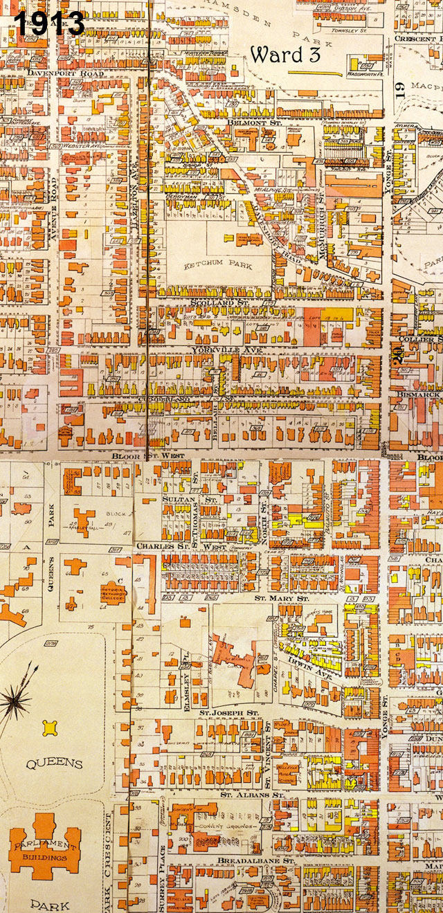
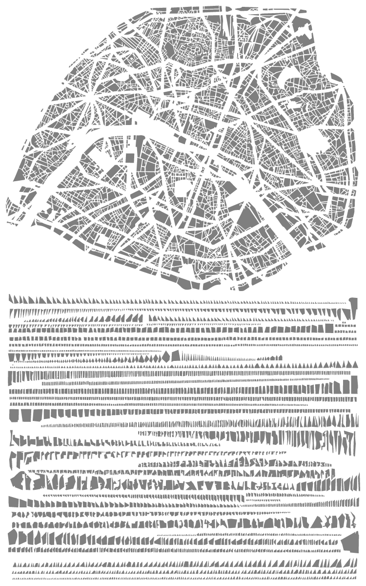
Image 01Image 01Image 01Image 01Image 01