urbanism – landscape – ideas – theory – whimsy

Before Bay St Divided Yorkville

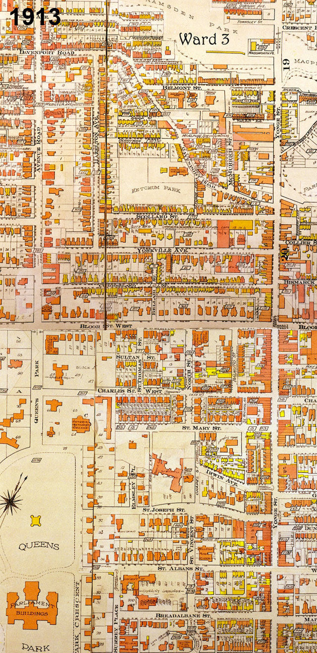
Goad Atlas fire insurance map showing the area between Yonge St and Queen's Park/Avenue Rd from near College St to Davenport Rd in 1913 - move over with mouse to see the same area in 1924 after Bay St was cut through

One of Toronto’s little historical secrets is the mystery of why Bay St does such a large jog at Queen St. History buffs may know the answer, but I only recently came upon it myself, and it answered many questions I’d long had about the strange disconnect in (of all places) Yorkville between Yonge St and the centre of what we now think of as Yorkville, the area west of Bay St.

The jog on Bay St creates one of Toronto’s most spectacular urban design moments, but it was far from deliberately planned that way – the placement of the tower of Old City Hall simply took advantage of a precondition in which Bay St ended at Queen St. What is today Bay St north of Queen St was originally a separate street running between Queen St and College St called Terauley St. Terauley St and the grid north of Queen St were originally laid out as part of a separate estate that did not line up with the grid south of Queen (even University Ave did not originally extend south of Queen St, whereas Yonge St was the exception as it was the original concession road).

North of College St there was a one block break, and then a series of streets with slightly different alignments (called St Vincent St, Chapel St and North St) continued the rough line of Terauley St north to Bloor St. North of Bloor St, no streets crossed through Yorkville along the Terauley St alignment. In the early 1920’s, the City decided to cut the Terauley alignment all the way through from Queen St to Davenport Rd and rename it as an extension of Bay St. The late date of Bay St’s creation north of Queen partly explains the lack of significant historical buildings along the street.

The effect in Yorkville has been more profound, as Bay St essentially split the old village in two. Originally, the centre of Yorkville was clearly along Yonge St (very few commercial buildings even existed at the time along Bloor St). Both the library and the fire hall were located close to Yonge St on Yorkville Ave. Since the 1920’s and the cutting through of Bay St, the fortunes of Yorkville west and east of Bay seem to have gone in different directions. While Yonge St has lost most of its connection to Yorkville and sense of it’s former individuality, Yorkville west of Bay was destined to become a centre for artists and alternative culture and finally a very unique boutique shopping district, maintaining a significant amount of its character and village feeling.

The Subway to Nowhere?

Vaughan north of highway 407 (source: google maps)

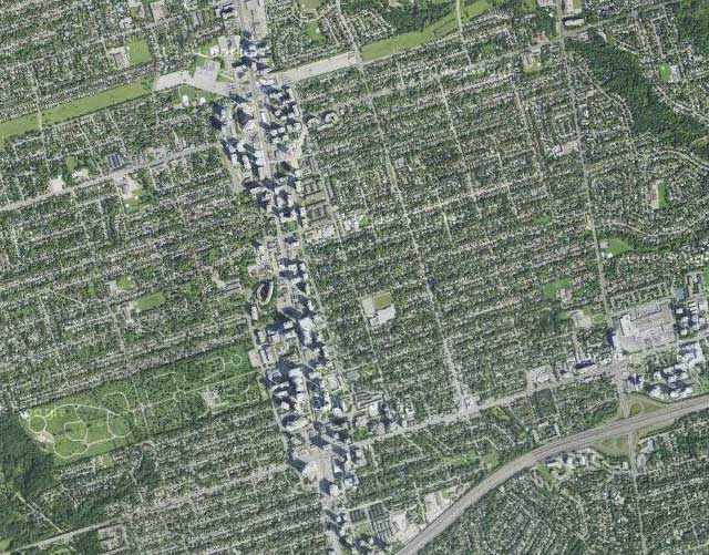
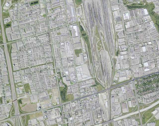
The Spadina subway extension to Vaughan is under construction and scheduled to be open for the end of 2015, but where exactly is this thing going? Sure it goes to York University (which I think most people would accept is a good idea), but there will be a full 2 more stations north of Steeles Ave into Vaughan, so what exactly is up there? See above… Oh dear… It looks like we’re extending a subway line that originally kind of went to nowhere, to another even more extreme nowhere, a vast sea of single-storey warehousing, manufacturing, big box stores and railway lands. But wait! Building a subway will result in massive development right? So this area is ripe for a total makeover, right? Oh wait a minute… here’s the famed subway-driven development along the Yonge St corridor north of highway 401 from Sheppard Ave to north of Finch at the same scale, the result of almost 40 years of development (see below).

Yonge St development corridor north of highway 401 at the same scale (source: google maps)

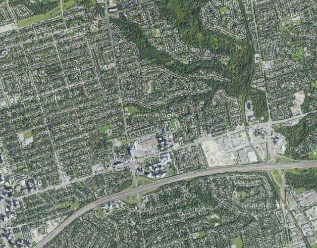
I guess the even more modest kind of development around the Sheppard Line wouldn’t have much of an effect either (see below).

Sheppard Ave development corridor north of highway 401 at the same scale (source: google maps)

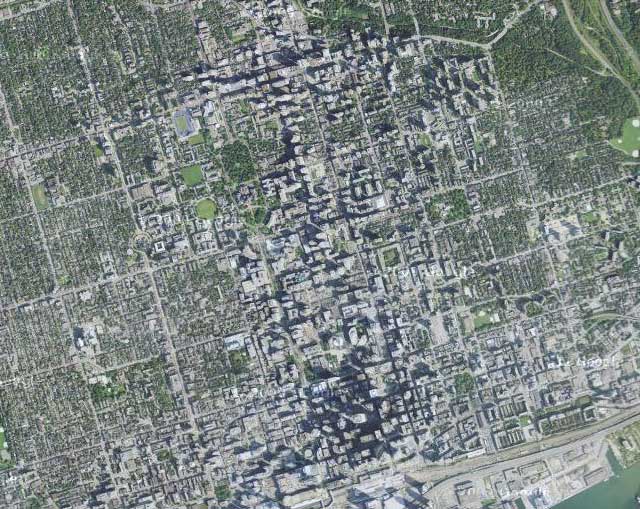
So just how large is this sea of nothingness that we’ve sent a subway line to? Oh, that’s right, as large as the entire downtown core of Toronto (see below). Damn.

Downtown Toronto from the Union Station to Bloor at the same scale (source: google maps)

Evolutionary Space in the Junction

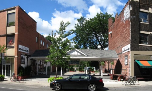
August 2008 - Band shelter and (temporary?) public space

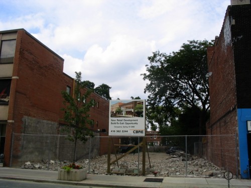
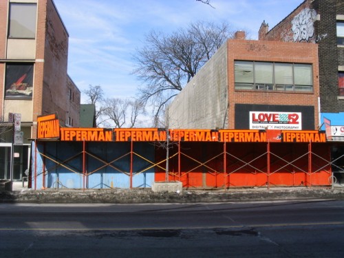
An interesting evolutionary space has been created in the Junction on a vacant lot where some retail buildings were demolished in 2007. The empty site (which was originally being advertised as a “New Retail Development Build-to-Suit Opportunity”) was rehabilitated as an outdoor stage venue (the “Junction Train Platform”) as part of the centennial celebrations commemorating 100 years since the former City of West Toronto was incorporated. The (I think temporary) space has been outfitted with some seating and temporary plant material and seems to be a pretty popular place for people to relax and have a conversation. Behind the potted evergreens at the back I think are some parking spots. It’s a great use of what was essentially a barren, desolate gap in the urban fabric! More on the City of West Toronto Centennial celebrations, West Toronto Junction Historical Society and The Junction BIA.

August 2007 - "New Retail Development Build-to-Suit Opportunity"

March 2007 - Buildings in process of being demolished

Free Wireless for the Waterfront Please

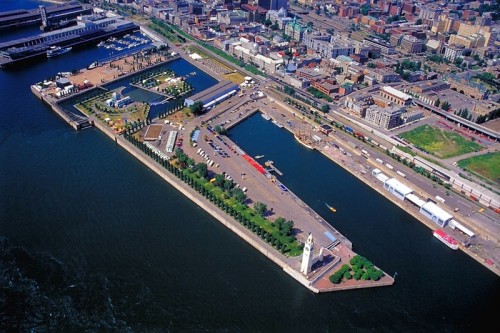
Free Wifi Zone in Montreal's Old Port

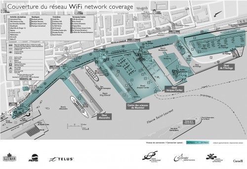
Map: Free Wifi Zone in Montreal's Old Port

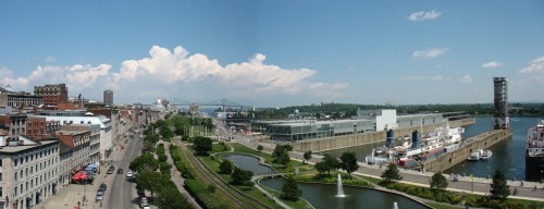
I hope WaterfronToronto is paying attention – here’s a map of the free wifi zone (via sponsors) at the waterfront in Montreal’s Old Port (source). The zone was set up for and is under the jurisdiction of Les Quais du Vieux-Port (The Quays of the Old Port) – a 47.3-hectare (117-acre) territory with 2.7 kilometres of St Lawrence River waterfront – which is itself an entity created and managed by the federal agency in control of the entire Old Port, Société du Vieux-Port de Montréal (Old Port of Montreal Corporation).

Photo: Panorama of Montreal's Old Port

Photo: Panorama of Montreal's Old Port

Apparently Telus is the sponsor responsible for providing the actual wifi service, with other sponsors covering the costs. While some of us might prefer that something like Wireless Toronto (a volunteer-run not-for-profit community group dedicated to setting up free wifi hotspots around the city) were the one’s running something like this, the size of Montreal’s wifi zone would probably be too infrastructurally complicated and expensive for a small group like Wireless Toronto. Wireless Toronto have set up one of their hotspots at York Quay at Harbourfront Centre, though it’s fairly geographically limited. One of the most interesting aspects of Montreal’s zone is how the two marina areas are deliberately included allowing wifi access from moored boats! Toronto Hydro’s One Zone wireless network (which covers most of the downtown area) is not free and does not currently cover any part of the waterfront, and I think it’s the wrong model to pursue for the waterfront. I think free wifi on the waterfront would be a great way to encourage waterfront users of all kinds, and would be the kind of forward-looking optimistic project we really need to kick off the “idea” of the waterfront revitalization.

Old Port of Montreal from the air

Photo: Old Port of Montreal from the air

However, we should be a little careful when we look at the Montreal model – the Old Port area controlled by the Corporation is federal land, but being owned and operated by the Corporation actually means it is not technically public space. There are in fact a list of “site rules“, buskers and other entertainers are auditioned and require permits (as with many other tourist areas), leafletting and soliciting are not allowed, “activities may not be held or promoted on the site without permission” and “filming or photography for other than personal use must be authorized”. These are dangerous precedents for Toronto’s waterfront – while this post has mostly been about free wifi, I think the principle of freedom needs to additionally extend to the use of public space at the waterfront.

Gardiner to Come Tumbling Down… kind of

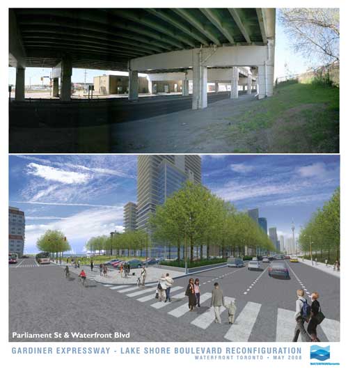
Parliament St & Waterfront Blvd

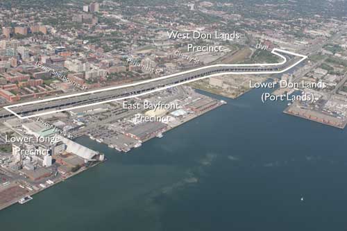
In an announcement with significant ramifications for the waterfront, the much-maligned Gardiner Expressway is to come tumbling down…. at least part of it. Waterfront Toronto, the City and the provincial Ministry of Public Infrastructure Renewal together appear to have stumbled into a momentous decision with the removal of funding for the Front St Extension and the (resulting?) decision to demolish the portion of the Gardiner from east of Jarvis to the Don Valley Parkway.

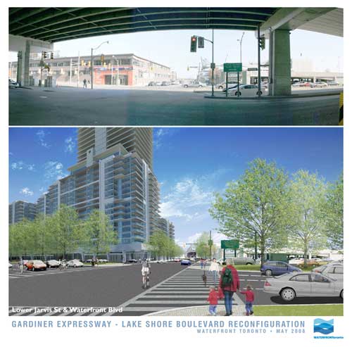
Lower Jarvis St & Waterfront Blvd

In these images released today, Waterfront Toronto gives us an idea of what the demolition of the Gardiner may mean at street level. And frankly, if this is the way it’s handled, it looks fantastic – with the added benefit (not shown in the renderings) that the railway corridor is not as wide by the time it gets to Jarvis, meaning there could be a window of hope for a relatively pleasant passage down to the lake for the East Side, all of a sudden making Waterfront Toronto’s proposed developments at West Don Lands, East Bayfront and in the future at the portlands, seem far more connected and potentially vibrant. Could this be a great day in the history of Toronto’s waterfront?

Hold your horses there…. I’m not so sure. While clearly this is a decision many of us have been gagging for for years (nay, decades!), in typical Toronto fashion are we bollocking up one of the most important decisions in the city’s planning history? While the renderings show a relatively tamed boulevard at grade (along the lines of University Avenue perhaps), the plan almost seems a slap in the face to the functionality of the Don Valley Parkway and the Gardiner combined. Now in a way it’s great that expressway functionality is not determining the decision making here, but this decision has huge ramifications on two very important roads that currently connect and essentially function as one road. While many will say “who cares”, what exactly are the expected traffic volumes on this at-grade road and how tamed and crossable will this really make it? I mean if it’s essentially a Gardiner at grade with a pedestrian signal every 5 minutes, I’m not so sure this is a good thing.

But apart from that, the mind-boggling, ridiculous, tear-you-hair-out frustration of this scheme is that if you’re making such a mess of the Gardiner and its “flow”, doesn’t it just make sense to demolish the whole damn thing while you’re at it (at least make it part of the plan to do so!)? Why on earth should the Gardiner remain above grade as it crosses the foot of Yonge Street, the most important damn street in the City and the Province, and come down at Jarvis? If you’re screwing up the Gardiner anyway, and the projected volumes are nice enough to cross at grade, then bring the whole damn thing to grade out at Strachan and open up Fort York to the lake, give City Place a chance to be an actual place, and dish out the benefits to the whole central waterfront while you’re at it.

But no. Just like Toronto to do something like this half-assed and (surprise, surprise) solely for the benefit of Waterfront Toronto’s proposed developments alone. Message delivered: central waterfront, go f**k yourself!

Area to be demolished

Sugar Beach for Jarvis Slip – a Defense

The Star’s Christopher Hume today wrote a scathing attack on Waterfront Toronto’s jury of “insiders” for its choice of Sugar Beach as winner of the Jarvis Slip Public Space Innovative Design Competition (see images from the 3 designs in our previous post).

Hume suggests that we were in fact making a choice between a couple of giant movable arms and a giant screen wind scuplture, but has the gall to say that architect Siamak Hariri may create admirable buildings but “has never shown any special understanding of the landscape”. Sorry Mr. Hume, reducing a landscape architectural public space project in a waterfront location to a choice between two sculptures (however animate) doesn’t show much special understanding of the landscape on your part either. The two features of the design proposals that seemed to attract the most attention both existed essentially in a vacuum disconnected from the site or its context, having no sensible relationship to the surrounding landscape, nor any spatial qualities that would add to the spatial experience of Jarvis Slip.
Yes, the wind sculpture by Ned Kahn would be fantastic, but what is the compelling reason for it to be in this location, and how is it remotely site-specific if it’s essentially similar to all of Kahn’s other wind sculptures? In fact, the Weatherfront team went out of its way to fuss about how we get our weather from Pearson International instead of the waterfront, but since weather stations are traditionally located at airports, the best place for this Ned Kahn sculpture would in fact be directly across from the island airport, not at Jarvis Slip. Not to mention the perversity of placing a screen of this kind across the line-of-sight of the best view from Jarvis Slip (across to the islands), or the fact that the ripples, waves and motion of water in a bay as large as Toronto’s harbour is nearly as endlessly interesting, fluid and dynamic as Kahn’s sculpture would have been, so again, why here? In fact, such a sculpture would be awesome covering one of the buildings facing Dundas Square, not here where the natural glories of Toronto’s harbour are on full display for all to see.

Hume does have a point in his skewering of the machinations of the jury in choosing Sugar Beach while proposing 14 modifications to the design including creating the beach somewhere else instead.

If you set up an “Innovative Design Competition” and then choose what was perhaps the least innovative of the entries, there is something to answer for, but in this case, maybe we should question the use of a competition such as this for this site, and the criteria for innovation we were really after – that is, innovation in public space, not in public art. The innovations in the West8/DTAH and Weatherfront designs were both essentially sculptural, while the overall designs for both were uninspiring and even adversarial to their context.

I am reprinting below the defense of Sugar Beach I posted as a comment over at Spacing Toronto:

———————–
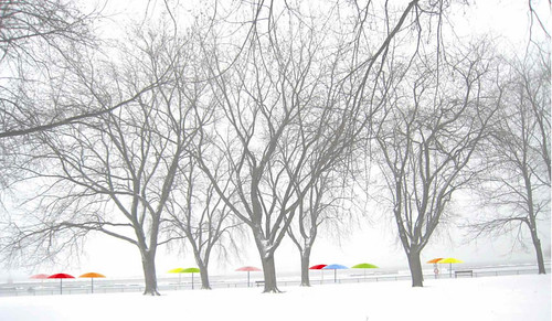
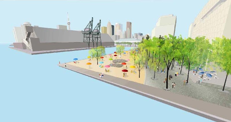
I agree with the choice of Sugar Beach for several reasons (to the chagrin of friends at DTAH who think I have a conflict of interest, though I had nothing to do with the design). I think it’s true that it may take some selling for the idea of a beach in this location to be given credibility, but personally I think the juxtaposition of industrial and recreation uses could be exciting and interesting.

As to the year-round use, it hardly feels like the site would be a place for people to naturally convene in winter anyways – how much effort should be expended on attracting people in winter to exposed west-facing sites bound to be windswept and cold? The location of the site next to the potentially inanimate private use of the Corus building hardly bills it as the Dundas Square of the waterfront.

I think if you only ask 3 teams for submissions (all of whom have already done work along the waterfront) you’re really handicapping the possibilities of the location – in this case, as exciting and attention-grabbing as the West8/DTAH scheme was, it failed to really evoke or respond to the specific place of Jarvis Slip and, without the gimmick of the arms, didn’t have a leg to stand on…

I think there’s a little bit of genius simply to the name “Sugar Beach” – I can imagine years from now, with the Redpath plant long gone, the subtle evocation of the relationship carrying on in the identity of this place – “meet me at Sugar Beach” sounds so much better than “meet me at those big arms that stopped working years ago down by the waterfront”. While the name HtO was clever but gimmicky. I feel it will eventually fade as a name through lack of use, Sugar Beach as a name seems like it will have lasting power and be able to become part of the physical and psychological landscape of the city.

Beyond the name, the design for the Sugar Beach scheme itself was well-thought out – not too complicated or cluttered, and just seemed to be a natural extension of the city and waterfront. In particular, the use of the angled waterfront promenade continuing the line of sight from Jarvis from the original East Bayfront Precinct Plan seems highly appropriate in guiding most pedestrian/active through-traffic in a direct desire-line to continue along the east bayfront, while the more passive use of the beach wedges in on the water side of the promenade.

While some people seemed against the use of rock-mounds (maybe it depends on whether or not you like the Cumberland Park version…) I think the way that they’ve been used in the Sugar Beach scheme is appropriate and a more subtle evocation of the canadian landscape than the West8/DTAH version which seemed to be trying too hard to be canadian. The rocks coming out of the sand of the beach seems like a great idea too, while larger rocks in front of the face of the Corus building seems like a good response to the future private nature of that building.

I think Sugar Beach will be a great place, appropriate to where it is, and with the potential to be an interesting hiatus on a walk along the waterfront. I think it’s worth remembering that too much glam and style in landscape architecture rarely tends to be long-lasting, but is too easily convincing in renderings and models. Old parks maintain their charm because they’re timeless, not because they were gimmicky. While certain key, central locations can more than withstand a glam and style design, Jarvis Slip is not this location, because people have no reason to be here – given that reality, Sugar Beach wins out…

I think in the end, Sugar Beach can be said to be representing the establishment and extension of something of a “style” for Toronto’s waterfront, a style that seems built on something that has come out of this city (regardless of Cormier being from Montreal). Something in the essence of Toronto got expressed in the success of HtO – but some people seem hell-bent to turn Toronto into something “else” – no doubt they also think the ROM and AGO renovations actually have something to do with Toronto instead of just happen to be here. It seems like the ultimate test of whether you love Toronto, as it is, with its quirks, foibles, frustrations, and just want it to get better, or whether deep down, you just want Toronto to be somewhere else – Chicago perhaps, or New York, Vancouver, Montreal, London – it’s always somewhere else that’s stylish, that’s good, that has taste, that has innovation – the grass is always greener somewhere else.

But from my point of view, Sugar Beach will only add to the greenness of the grass in our garden down by the waterfront. We should stop pissing all over Waterfront Toronto – the establishment of the urban design review process implies that the members of the panel are knowingly guiding development and public space towards the greater goals in the public interest that have been established by Waterfront Toronto’s planning work – even when that means they have to override the whims of individual designers (and, god forbid, newspaper columnists). In this case, the only true test will be in what gets built, and how well it works. Until then, we need to have a little faith. All is not lost. Sugar Beach will be a great place.
McBride Cycle Building Vanishing Act


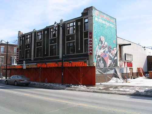
Photo: The McBride store at the beginning of demolition


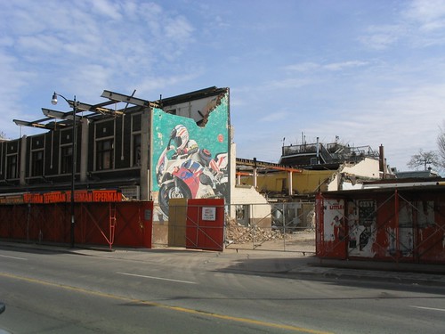
Photo: The McBride store partway through demolition


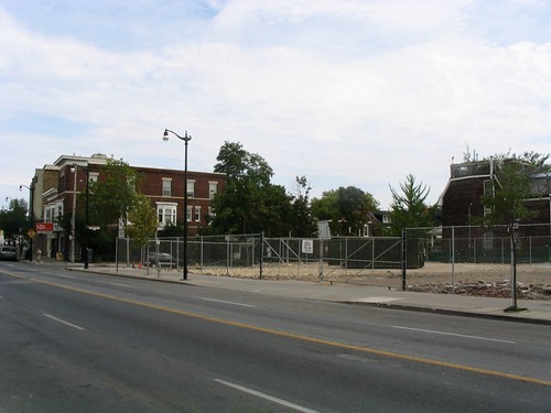
Photo: The McBride vacant site after demolition

Demolition of the old McBride Cycle store on Dundas West east of Keele was completed earlier in the summer, after the family-run business, which had been serving the community for 97 years, went into receivership last year. Now real estate for sale signs have been erected on the site, yet there does not appear to be the usual development application notice we’ve become so used to.

It seems odd (dare I say ridiculous?) to demolish a building before trying to sell the site, but of course Toronto’s a city where having a building with any heritage value whatsoever is seen as a detriment to profitability. The original building was a very nicely scaled early 20th century commercial building, and at first glance it seems incredible that it wasn’t an easy candidate for quick conversion into lofts.

Gord Perks (the local councillor) wrote on his blog earlier this year that the building would be demolished and that a 74 unit condominium with retail/commercial at grade was being proposed – one now wonders (given the lack of a development application notice and presence of for sale signs) whether the original developer’s plans have been abandoned.

Now that the building has been demolished, it’s true that a relatively intense version of Toronto’s current condo-building trend is probably the kind of shot in the arm this stretch of Dundas West (and the Junction as a whole) needs, it’s just a pity that (as seems so usual) the existing, beautiful building couldn’t have been saved as part of these plans despite seeming so suited to the conversion – but of course, there are no incentives whatsoever for doing so apart from the goodness of someone’s heart. Where are all those good hearts anyways?

A sense of scale, a sense of space, a sense of place?

Construction Hoarding on St. Thomas
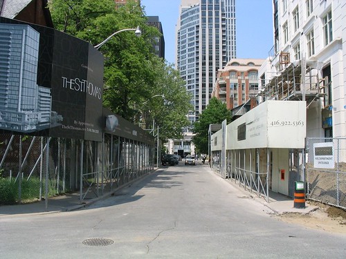
Photo: St. Thomas St, Yorkville

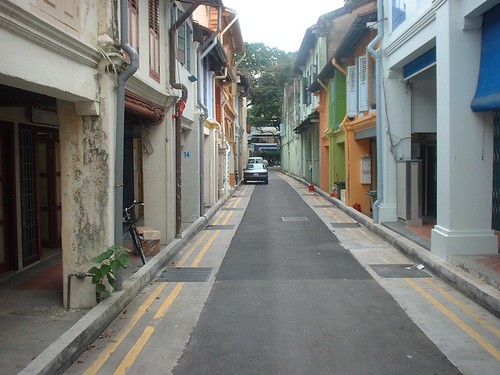
A second construction hoarding was erected on St. Thomas St south of Bloor recently, across the street from an existing hoarding (which has since been taken down). For a short time, the two facing hoardings protecting the sidewalks appeared to resemble a street lined with arcades, in its small spatial scale not unlike many you will see in southeast asia, such as this one in Singapore.

Street with arcades, Singapore
Photo: Street/lane in Singapore

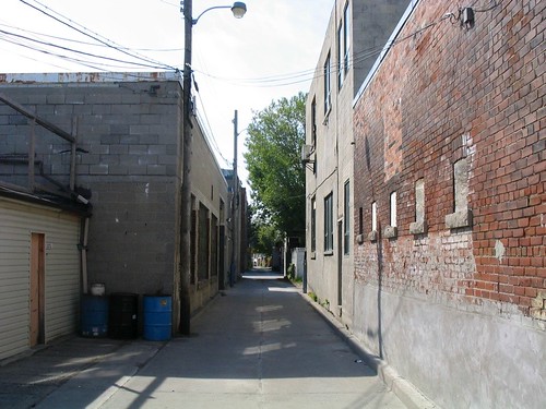
This small scale of space is a relatively infrequent occurrence in Toronto, especially as part of a public street. While we’re used to such small scales in our back alleys, those alleys are, with but few exceptions, the city’s backdoors – infrequently travelled and largely empty, with few uses facing on to them other than the occasional residence and dominated by garages or blank walls and service entries. They do not really form a part of the public face of the city or city life.


Photo: Laneway in the Junction


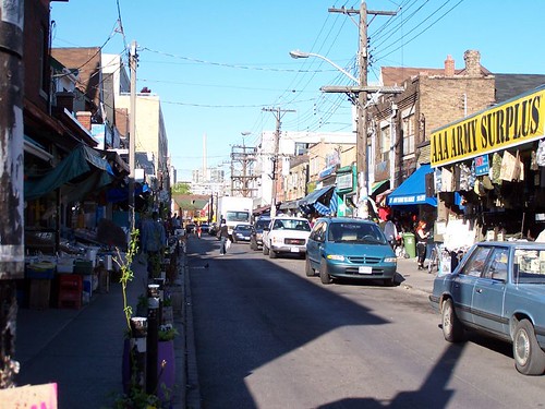
Photo: Kensington Market (photo by raptortheangel)

Somewhere approaching this scale of space that is part of the public face of the city is most famously exemplified by Kensington Market, where not only the buildings, produce and products are jostled up against the sidewalk, but the streets are narrow and bustling with people, and to add to the compression of space, filled with parked cars and delivery trucks and slowly crawling traffic. It all adds up to a very human (dare we say humane?) scale that somehow makes you feel comfortable, as though you’ve been enveloped in the city. In fact, Kensington moves beyond a sense of space, and somehow transcends that rather empty word, to have evolved a sense of place, one that is both undeniable and unique.


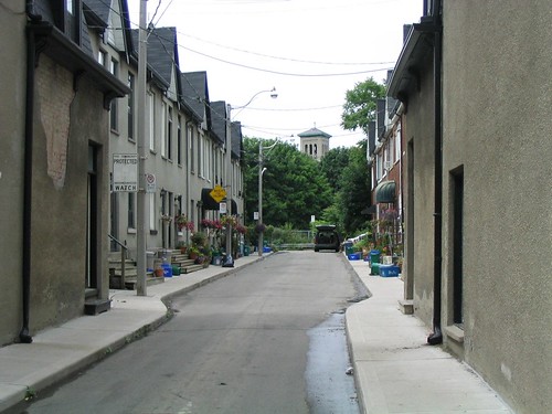
Photo: Wilkins Ave, off King St E, east of Parliament

There are a few other examples of small space in the city, but they tend to be rather hidden and brief moments – although that just makes them seem all the more jewel-like when you discover them.


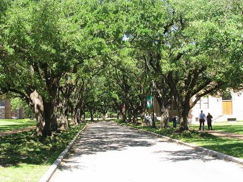
Photo: Tree-lined street at Rice University, Houston

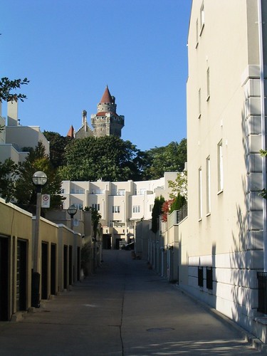
While small space is not the only way to attempt to foster sense of place, I think that there is some connection between this sense of scale, sense of space and sense of place. Similar effects of scale can even be created by the canopies of closely-spaced street trees, as at Rice University (above), but can also be misguided in implementation as in this accident of line-of-sight where Casa Loma’s tower is perfectly framed by the laneway between Walmer Rd and Spadina Rd south of Davenport, which doesn’t so much benefit the laneway itself, but creates some sense of drama and intrigue for all those people walking along MacPherson Ave towards George Brown College.
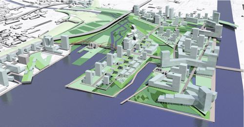

Photo: Looking towards Casa Loma up rear lane between Walmer Rd and Spadina Rd

Whether or not anyone agrees with me about the importance of small scale when it comes to sense of place, I think we can safely say that a key missing ingredient in the urbanities being created in suburban locales around Toronto (and the rest of north america) is the absence of small-scaled space. This absence has been compensated for in many different ways, but most notably (need I say, horrifically and ironically?) by the deliberately pedestrian scale of space of the “shopping street” inside the typical mall and, more recently, by the creation of “pedestrian-oriented” centres in suburban locales, usually surrounded by seas of parking and/or parking garages and huge arterial roads and/or expressways. These new “centres”, sometimes presumed to be the end of the mall (and often replacing them), are in reality the mall’s evolution into a more plausible (but still staged) “reality”, one that is once again based upon the smaller scale that has become nostalgically associated with our cities’ historic centres and main streets.

Whether this small scale can once again be more fully integrated into the urban environments we are building may depend on the level of commitment we as a society are willing to make to creating spaces and places planned and designed around people instead of cars. On this question the jury’s still out. Despite recent progress and a lot of talk to the contrary, the evidence on the ground does not convince.

MVVA wins Lower Don Lands competition

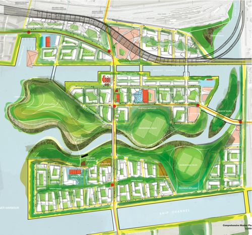
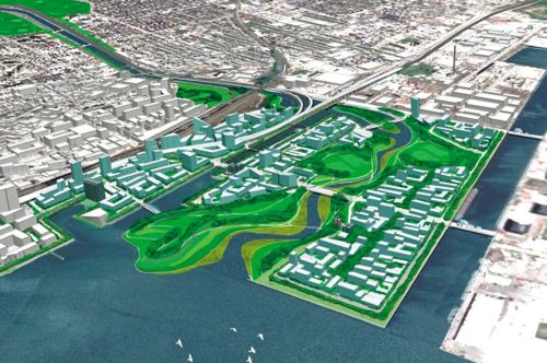
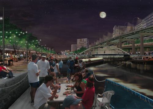
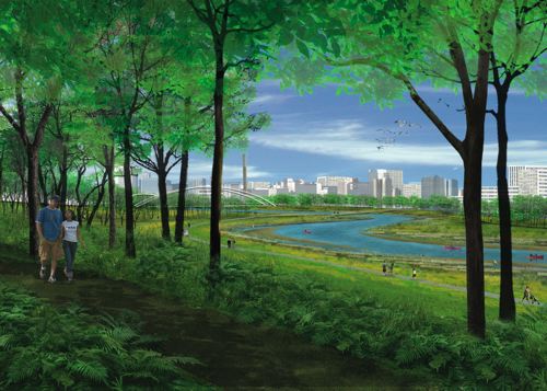
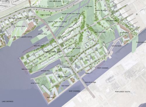
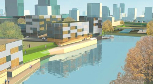
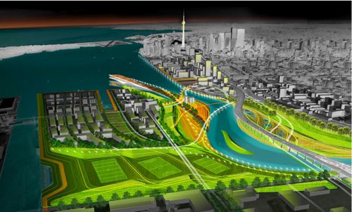
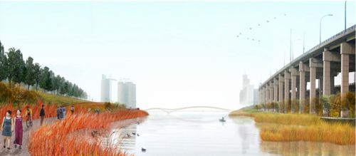
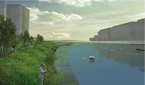
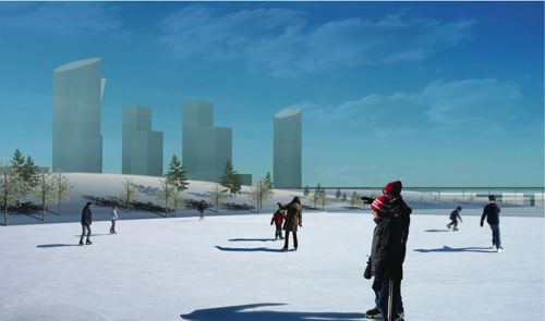
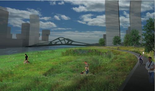
The TWRC announced yesterday that the Michael Van Valkenburgh Associates, Inc. (MVVA)/Behnisch Architects/Greenberg Consultants/Great Eastern Ecology team won the Lower Donlands Design Competition. More information on the team’s entry can be found at the TWRC site.

mvva-img2-2-sm.jpg

mvva-img3-sm.jpg

mvva-img4-sm.jpg

The full team included:

Michael Van Valkenburgh Associates, Inc. (MVVA), New York & Massachusetts, USA
Limno Tech Inc., Michigan, USA
Applied Ecological Services Inc., Wisconsin, USA
Great Eastern Ecology, New York, USA
Greenberg Consultants Inc., Ontario, CANADA
Behnisch Architects, Los Angeles, CA, USA & Stuttgart, DEU
Transsolar Energietechnik, New York, USA & Stuttgart, DEU
RFR Engineering, Paris, FR
Totten Sims Hubicki and Associates (TSH), Ontario, CANADA
ARUP, Ontario, CANADA

Congratulations (and commiserations) should also go to the other teams for very fine submissions, particularly the Weiss/Manfredi DTAH scheme which I’m sure was a very close second.

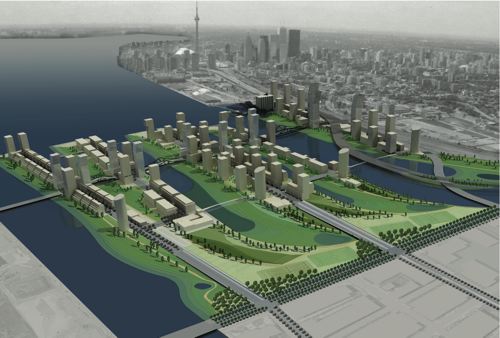
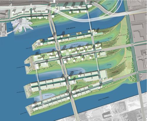
Designs released for Lower Don Lands

mvva-img2-2-sm.jpg

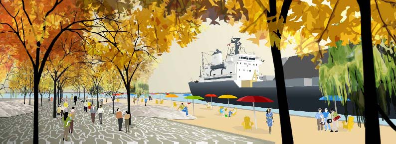
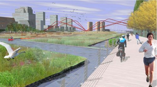
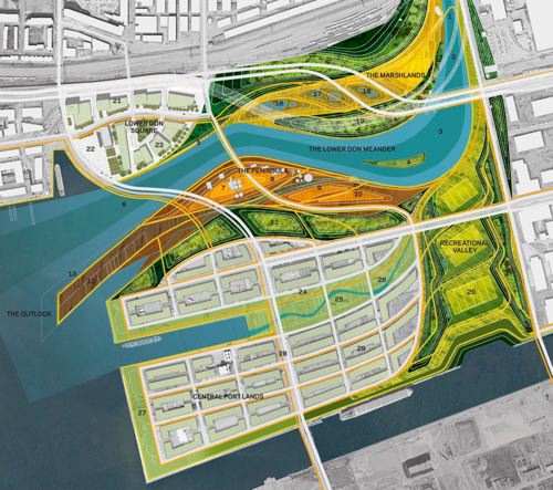
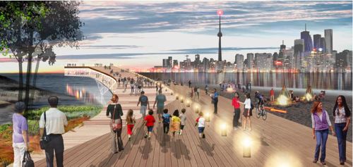
The designs for the Lower Don Lands from the 4 shortlisted teams in the “Innovative Design Competition for the Lower Don Lands” being run by the TWRC were released today in conjunction with an exhibition (including lovely models) at BCE Place. The Exhibition Launch and Public Forum is on Monday April 16 from 6-9 pm at the Allan Lambert Galleria in BCE Place (181 Bay Street). PDF’s of the full display panels are available from the TWRC website.
———————————————————-

STOSS INC./Brown + Storey Architects/ZAS Architects

stoss-img1-sm.jpg

stoss-img2-2-sm.jpg

stoss-img5-sm.jpg

stoss-img4-sm.jpg

STOSS INC., Boston, MA
BROWN + STOREY ARCHITECTS, Toronto, ON
ZAS ARCHITECTS Inc., Toronto, ON
Brookner Studio
Nina-Marie Lister
Applied Ecological Systems
Pine + Swallow Associates
Nitsch Engineering, Inc.
Moffatt + Nichol
ARUP
Kidd Consulting
Consult Econ, Inc.
The Map Office

———————————————————-

MVVA/Behnisch Architects/Greenberg Cnsltnts/Great Eastern Ecology

mvva-img1-sm.jpg

mvva-img2-2-sm.jpg

mvva-img3-sm.jpg

mvva-img4-sm.jpg

Michael Van Valkenburgh Associates, Inc. (MVVA), New York & Massachusetts, USA
Limno Tech Inc., Michigan, USA
Applied Ecological Services Inc., Wisconsin, USA
Great Eastern Ecology, New York, USA
Greenberg Consultants Inc., Ontario, CANADA
Behnisch Architects, Los Angeles, CA, USA & Stuttgart, DEU
Transsolar Energietechnik, New York, USA & Stuttgart, DEU
RFR Engineering, Paris, FR
Totten Sims Hubicki and Associates (TSH), Ontario, CANADA
ARUP, Ontario, CANADA

———————————————————-

Weiss/Manfredi & du Toit Allsopp Hillier

weiss-manfredi-img4-sm.jpg

weiss-manfredi-img1-sm.jpg

weiss-manfredi-img3-sm.jpg

weiss-manfredi-img2-sm.jpg

Weiss/Manfredi, New York, NY
du Toit Allsopp Hillier (DTAH), Toronto, CANADA
McCormick Rankin Corporation
Golder Associates Ltd.
Biohabitats, Inc.

———————————————————-

Atelier GIROT/Office of Landscape Morphology/ReK Productions

ateliergirot-img1-sm.jpg

ateliergirot-img2-sm.jpg

ateliergirot-img3-sm.jpg

ateliergirot-img4-sm.jpg

ateliergirot-img7-sm.jpg

Atelier GIROT, Zurich, Switzerland
Office of Landscape Morphology, Paris, FRANCE
Jürgen Mayer H., Berlin, GERMANY
ReK productions
Arup, California, USA
Philip Ursprung
Applied Ecological Services