urbanism – landscape – ideas – theory – whimsy

“The more you drive, the less intelligent you are”

repoman_still1.jpg

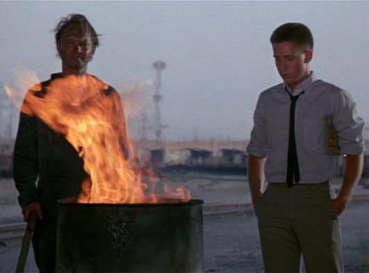
This one goes out to my good bud over at the Allderblob, who’s feeling kind of down and unappreciated. Amongst some memorable moments in the 1984 cult classic Repo Man, is this philosophical interregnum around an oil-drum fire, in which Miller extols the value of riding the bus – it gives him time to think. As he says,

“The more you drive, the less intelligent you are.”

–Miller (Tracey Walter)

In a wacky world whose oil-obsessed car culture has been so degrading and destructive (something hinted at presciently throughout Repo Man), thank God for the Millers among us, those kooks who see through the spectacle of our society and refuse to let the “real world” compromise the truth as they see it, even when it drags them through the muck and gets them down.

Here’s to you and your ilk, Allderblob!

Beautiful Urban Moments – Part VIII

284_8483_e.jpg

On my way to work this morning, I noticed this strange reflection above the doorway of the “Christadelphians” building on Ossington between Dupont and Bloor. Investigating, I discovered that with the sun just coming over the city’s roofs, a metal medallion embedded in the wall of the house across the street was creating this perfect reflection on the opposite building – the moment was so fleeting, it had almost passed by the time I got the camera out. No doubt there will only be a few days a year when the reflection corresponds so wonderfully with an architectural feature. Who are the Christadelphians you ask? How the hell do I know, but it’s worth looking up, if you’re interested…

Merry Christmas from a Snowless Toronto!

284_8472_e.jpg

Christmas lights give cheer even when snowlessness abounds – houses on Lappin Avenue in the west end. Not to appear to stereotype, but I got the impression that the creators were Portuguese – masters in the art of eclectic decoration.

Merry Christmas/Happy Holidays!

Gardiner’s No Innocent

south-parkdale-1950s.jpg

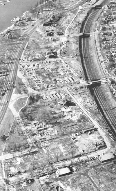
The demolition of South Parkdale circa 1956 to make way for the Gardiner Expressway, from Mike Filey’s “A Toronto Album 2: More Glimpses of the City That Was.” In Filey’s sanguine words:

“One minor problem associated with building the new highway was the need to demolish approximately 150 houses in the south Parkdale part of town – oh well.”

Oh well? For comparison, there are 262 homes currently on the Toronto Islands. The most striking thing you might notice about this stunning photograph is how the neighbourhood of south parkdale directly faced and related to the western waterfront across Lakeshore Boulevard – something almost unrecognizable along the western waterfront today since the area was excavated to build this section of the Gardiner. Note too the frequency and intimacy of the bridges crossing the railway corridor – a level of waterfront connectivity totally lost upon redevelopment and demolition (edit: a commenter pointed out that all 3 bridges in the photo still exist, it just seems like they knit the two sides together better because in the photo they do not end up at on ramps, highways and empty leftover green space as they do today).

Most interesting of all though, is how a whole neighbourhood like this can disappear without a trace. Were it not for Mr. Filey’s book, I would never have known, not being old enough to remember a different Toronto waterfront. In all the hubbub about the work of the TWRC and the revitalization of the Toronto waterfront, it’s worth remembering that we had a great waterfront once upon a time, and systematically, with cruel logic, we threw it all away. May we remember our lesson, and not let it happen again.

Pedestrian Traffic Signals Start Counting Down

284_8456_e.jpg

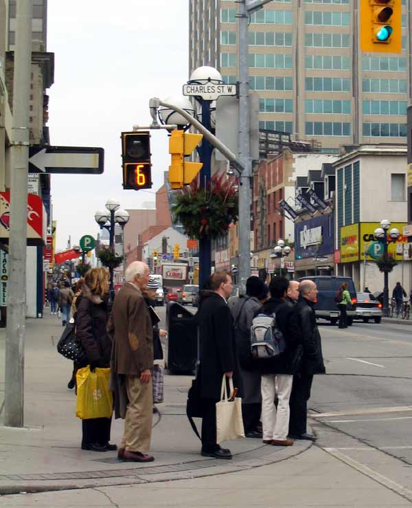
A long-awaited feature in traffic management is finally being implemented in Toronto with the introduction of a visual countdown (in seconds) for the pedestrian light at traffic signals. The countdown begins at the point when the pedestrian light starts flashing the orange hand (the hand is mid-flash in this photo). So far it’s a great success and makes things very convenient for pedestrians, letting them know whether or not they really have time to scoot across the road – especially on those annoying streets when the orange hand seems to flash forever and start mere seconds after the light turns green…. a great feature.

Mapping Our Urbanism Part II – Extents

ggh-growth-areas_det-e.jpg

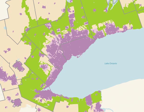
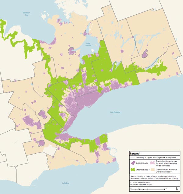
The Ontario Government’s revolution of planning in this province continues to move forward. The Places to Grow initiative (Growth Plan for the Greater Golden Horseshoe, see here) has been given a benchmark by a Technical Paper on a Proposed Methodology for Developing a Built Boundary for the Greater Golden Horseshoe, “an important component for monitoring the implementation of the Growth Plan” (see here). Essentially, what has been created is the most uptodate database of the current extents of development in the GGH (and by extension, the GTA). Knowing the current extents of development is crucial to being able to evaluate progress on the stringent intensification requirements demanded by Places to Grow and the implementation of the greenbelt.

What’s great for the purposes of mapping our urbanism is that these maps (excerpted from the new Technical Paper) give us an accurate and uptodate view of the extents of the city and greater region as it is essentially right now, and also how the extents of current development fit into the protected land of the greenbelt. This is quite a unique view of things, and one that is much clearer to read than a satellite photo.

ggh-growth-areas2e.jpg

Mapping Our Urbanism Part I – Snow Ploughing

snow-plow-map_toronto_det-e.jpg

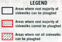
snow-plow-map_toronto_leg-e.jpg

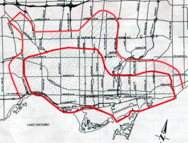
It might seem bizarre, but this map of sidewalk snow plowing service (which I found inside a publication called City Routes put out by Toronto’s Transportation Services available online here) speaks volumes about the different urban forms across the City of Toronto. The zone defined by the inner red line contains “areas where vast majority of sidewalks cannot be ploughed”. The reasons given are that “sidewalk snowploughs are not able to operate effectively due to sidewalk width and a lack of boulevard space for snow storage”. No doubt on-street parking also plays a role, but the policy is also a legacy from the pre-amalgamation City of Toronto which to a large degree fell within the two reddish lines on the map, and which relied on residents and businesses to clear the sidewalk in front of their own premises.

However, using the old boundary of the pre-amalgamation City of Toronto as a means of defining the limits of a particular “urbanism” (shall we call that an amalgam of urban form and urban culture?) is not necessarily accurate, as some of the outlying areas began to be built at lower densities even while sticking to the grid system common throughout the older city (the same can be said of Vancouver, where looking at a map shows the City proper almost entirely gridded, a fact that hides the reality that much of the southern and eastern portions are essentially gridded lower-density suburbs).

So, I propose that this map of sidewalk snow ploughing service is actually a good measure of defining the older, traditional residential core of Toronto, an issue that can raise hackles of nostalgia when defined by other measures. The smaller sidewalks and lack of boulevards is highly suggestive of the more urban character of the residential streets in this zone, in particular, sidewalks being directly adjacent to the roadways and in most cases, on-street parking. This zone is also the one with the best pedestrian and transit connectivity. I haven’t checked, but I think you will also find that almost the entirety of the defined area was developed before about 1930 and much of it before the First World War, primarily as streetcar suburbs.

The street names are hard to read so I’ll describe the boundaries – the west boundary is Jane Street – Bloor West Village is one of the last neighbourhoods to stick to the older street tradition. To the north (west of Yonge) the boundary floats north of St. Clair, including many of the neighbourhoods a walking distance from St. Clair. To the east of Yonge, the north boundary swings down close to the Danforth, then runs east to about Victoria Park to include the eastern neighbourhoods of the old City. Of course, this line closely follows the pre-amalgamation boundary of the City of Toronto in many ways, with the northern “stub” removed, but in some ways this map bypasses the hard feelings associated with the whole amalgamation extravaganza to get right down to a question of urban form and lifestyle.

Here’s the full map to show the zone in context:

snow-plow-map_toronto-sm2e.jpg

Windows Live Local Preview ups the ante on VirtualCity

win-live-local_screenshot.jpg

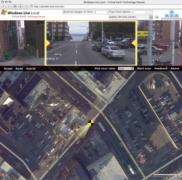
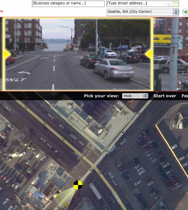
The Windows Live Local Preview ups the ante on the previously reported VirtualCity.ca (see post on Virtual City here). The Live Local Preview is only available for Seattle and San Francisco thus far, but the service (perhaps less practical than VirtualCity’s) has distinct experiential advantages. Instead of the side-on streetscape views focussed on the built form and shops, the Live Local Preview gives an experiential view down the street, with smaller views to left and right – and you can also essentially walk your way around with the detailed airphoto serving as a map. As you move location, the view changes relatively smoothly, essentially resembling video footage or a photo sequence of your walk. If you don’t choose “Walk” from the drop down window, you end up confined behind a car’s steering wheel looking through the windshield (boring!). Switch to “Street” view on the airphoto and you’re given the streetscape on either side as a continuous photomontage (if you’re zoomed in close enough), but it’s a bit small and couldn’t get it zoomed in any further. Using the mouse wheel lets you zoom in and out. On my Mac the interface was still a little clunky and unresponsive, but being a Windows release no doubt it’s optimized for Internet Explorer.

win-live-local_det.jpg

This is yet another step towards the seamless exploration of a city from a computer. Combine features of VirtualCity.ca and the Live Local Preview and you’re really getting somewhere. Some might tend to think that this suggests that at some point in the future no one will bother to explore their own city, and that all of the secret hidden locales of a city will be bared and exposed to the world, and that perhaps this will somehow ruin them. There’s an argument for saying that, but I’m not buying it. The amazing record that these sites are creating of certain cities at certain times is nothing short of amazing. The spatial and social experience of the city will always endure over virtual copies, especially so since the virtual copies are not even meant to replace the physical in the first place, they are tools enabling understanding, comprehension and evaluation of the city, while at the same time being a documentation of the unique physical reality of each city (at the human level) of extreme value.

Props to Tone for the heads up!

VirtualCity.ca delivers the real thing

virtualcity_caputre.jpg

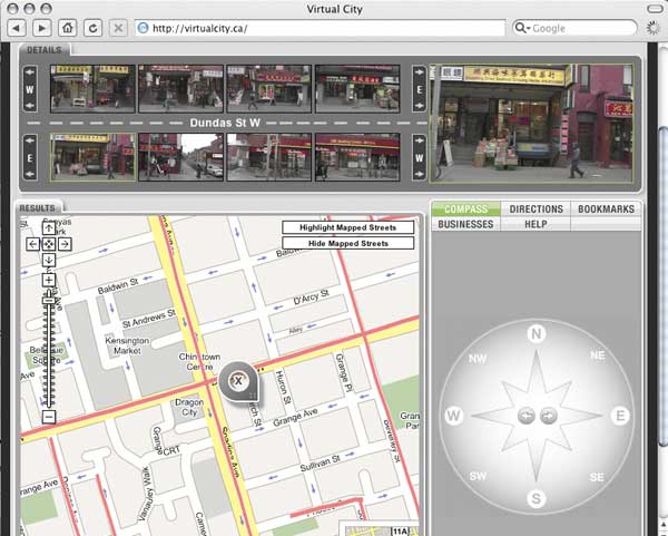
Readers of the Globe & Mail might have come across a reference to this amazing new site in last Friday’s Globe Review supplement – in case you missed it, I’m pleased to clue you in to something that will soon become indispensible and boundlessly useful for any city. The article by Ivor Tossell called “VirtualCity delivers the real thing” can be accessed (for now) here.

virtualcity_caputre_detail.jpg

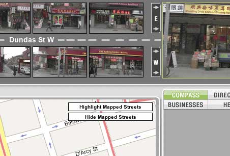
In short, virtualcity.ca has matched continuous photography of the entire streetscapes (primarily storefronts) of most of Toronto’s main streets to a google maps mapping system. All of a sudden, instead of the anonymous satellite photography of google maps, you can find exact views of the street corner you want to meet someone on, the restaurant you want to dine at, the apartment you’re on your way to see, etc. It’s amazing and near unbelievable. In fact, you can type in an address and find streetscape photography of it immediately. The site creators are working on adding residential streets to the system as well and a site for Montreal is in the works! Thank God for the internet! In Mr. Tossell’s nice words:

VirtualCity’s photos are more like day-in-the-life snapshots. Pedestrians walk the sidewalks. Streetcars and fire trucks obscure edges of the frame. You can see the detritus on front porches, recycling in the alleys, cars parked on the margins and the tail ends of streetcars retreating out of view. It’s a celebration of the urban mundane…

In trying to render a business service, VirtualCity has made a documentary of our streets that’s dispassionate, yet totally intimate. Indeed, the site is misnamed: It promises a virtual city, yet delivers the real thing, unadorned, grimy, on a lousy day, with fire trucks getting in the way of the camera.

And best of all by clicking on the top-right larger version of the active image you can view or download very high resolution images so that you can read store signage, check out street numbers or any number of things. I’m sold.

Personal Container Management

personal-container-mngmnt1.jpg

Designers have had a fascination with everything modular since the beginnings of modernism. That fascination runs from awe at the sublime machinations of contemporary shipping container ports with their amazing cranes and almost unreal scale, to the use of shipping containers in an enormous variety of architectural projects as housing, structure and works of art (see 50 selected projects utilizing shipping containers at fabprefab.com)

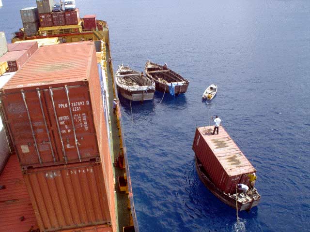
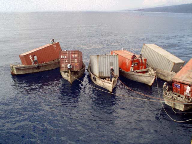
But there’s another side to shipping containers – a polar opposite of the inhuman scale and automation of massive port operations that reduce people to no more than ants. These photos from the 1980’s were taken before container shipping facilities were available in the tiny island nation of the Comoros in the ocean between Madagascar and Mozambique off the east coast of Africa. The containers are amazingly being lifted aboard small wooden boats just big enough for one each – with workers crawling all over them decidedly larger than ant-size.

You could be forgiven for thinking these are clever examples of Photoshop par excellence – but they’re not. They were published in the Nautical Institute’s “Seaways” magazine in January 2006 with the following caption:

“‘These remarkable photos were taken in the 1980s, when a liner company called Unicom operated a service to Moroni, Comoros Islands. At the time, this was the only means of getting the containers ashore.”

personal-container-mngmnt2.jpg

While it seems unlikely that the same situation exists anywhere today, it is wondrous and scary to think about how the way we move goods has fundamentally changed in the last 20 years or so as trade liberalization has come to dominate international economics. This almost comic situation represents a calamitous meeting of old economy and new – these men, stevedores (or longshoremen or dockers) in the true old sense, are perhaps using the same method and means as was traditionally used to move cargoes bit by bit from large ships too big to moor next to dock. Instead of more of a pile of looser smaller goods, the little boats have simply accommodated a singe container each.

I don’t mean to be some kind of neo-luddite, but the sheer humanity of these scenes put a huge smile on my face. Unfortunately, the Comoros is still one of the poorest countries in the world, so it’s no laughing matter – but there is something uplifting and wonderful about the ways that poor people with meagre resources manage to get by and get things done through sheer determination and hard work.

So cheers to the enterprising stevedores of the Comoros – wherever they may be now. To paraphrase The Road Warrior (aka Mad Max 2), this type of thing more and more “lives now, only in our memories”.

Photos originally found via www.cargolaw.com

personal-container-mngmnt3.jpg