urbanism – landscape – ideas – theory – whimsy

Kazakhstan Field Patterns

Collective Farms, Komsomolets, N. Kazakstan, April,2002

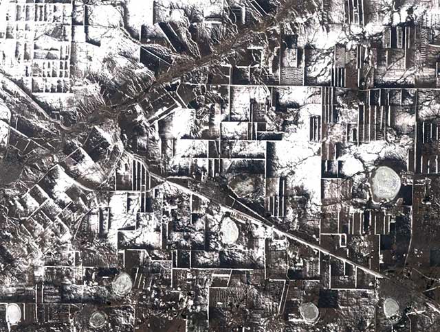
Geometrical field patterns in Kazakhstan created by dense plantings of tree rows as windbreaks. In the wake of the Borat controversy, it’s nice to step back a bit and discover something truly amazing and beautiful about the little-known country. The 3-dimensionality is eerie…

“This early spring view shows a rectangular maze of collective farms near the city of Komsomolets in northern Kazakstan. The “walls” surrounding the farms are actually dense rows of trees that serve as windbreaks. Snow has piled against the trees, which along with the accompanying shadows gives the scene a 3-dimensional appearance. The windbreaks were planted shortly after collective farming began in northern Kazakstan in the 1950’s, when it became evident that wind erosion of the soil was a problem. Also shown is a major roadway extending from lower right to upper left, crossing the Tobel river near Komsomolets, which appears as a dark circular patch mid-way up the left border of the scene.”

From the Landsat satellite gallery at the USGS

Toronto Transit Map Reimagined

ttc-map-rc3_crop_detail-e-sm2.png

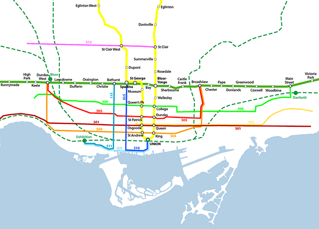
Somewhere someone was asking for someone to come up with a reimagined transit map for Toronto (could it have been Reading Toronto here?), so I thought I’d give it a shot. The one Graeme Stewart posted at Reading Toronto is interesting but I find it too schematic-looking. At the GTA level, scale is grossly distorted, but on the downtown detail map I love how he managed to integrate neighbourhood names into the map. Fantastic.

Part of his point was that more of the system should be shown than just the subway – the GO lines and the streetcars should be shown to represent more of the true nature of the “system” and I think I support his idea. However there are certain caveats and problems:

  1. Apart from supposed “dedicated right-of-way” LRT streetcar lines (such as Spadina’s 510 line and the Queen’s Quay lines and the western portion of the Queen 501 route along the Queensway), streetcar lines in Toronto are having serious problems moving swiftly through the city. One hears complaints of people being able to walk faster than the Queen cars move through traffic. Even the dedicated right-of-way lines have issues – a report I read indicated that the Spadina car on average is slower at getting its passengers down to Queen than the old pre-1997 buses were – I also have friends who live out near Mimico for whom in most cases taking the subway and getting a bus is quicker than the 501 car. This does beg the question of whether they should be included when some frequent service time-efficient bus routes are not.
  2. On Stewart’s GTA map (here), GO Transit’s rail network is given heavy prominence next to the subway lines. Indeed on GO’s own system map, their train network is given heavy coloured-line subway-like prominence, with the bus network as more generic thinner green lines. I flirted with this idea, but for now have settled for a more toned-back approach to the GO network for the simple reason that until higher frequencies are achieved and more serious urban centre-type development occurs around GO stations, the system currently bears little resemblance (in reality) to an LRT, BRT (Bus Rapid Transit), or subway system since it is heavily skewed towards commuter traffic alone.
  3. VIVA is here – York Region’s BRT transit offering is up-and-running (for a year now), and should be given heavier priority at the regional scale. I dream of a day when an integrated fare-structure allows simple and straightforward use of all these systems together with full transfer privileges and no complications – perhaps trying to envision what the system even looks like as a whole is the first step? For now I have only shown full-service routes of VIVA, not peak-only. I don’t actually even know whether any of the other GTA municipalities have BRT-equivalent frequent-service routes to add – if they have, I haven’t heard of them.

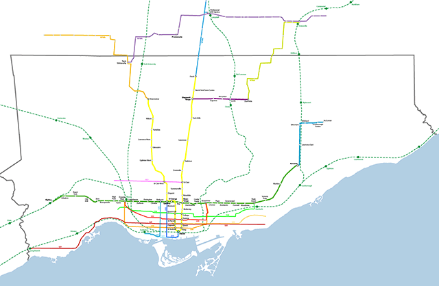
I am also working on a full GTA level map showing all GO lines to their ends. All of these maps are real-scale without distortions in space – the disadvantages are that at smaller sizes, things become harder to read and distinguish. It could be that after I’ve done these, then a simpler diagram version could be done that distorted distance as most existing transit maps do.

Style – I’ve tried to stick to the current TTC diagram style. Why? I kind of like it. I am from Toronto though. Others, such as Miguel Syyap’s quite wonderful TTC maps, have used London Underground’s famous style – which I must say looks good too! For some reason Syyap hasn’t shown an as-is system map using his style though. VIVA has adopted this same style for their diagrammatic system maps.

Here’s links to higher resolution versions of my map:

Toronto Transit Map – downtown detail

Toronto Transit Map – Metro +

Let me know what you think – any suggestions?

ttc-map-rc3_crop-e-sm.png

Also see our evolution of the TTC subway animated map from September 2007.

Development in Toronto Part VI – Gateism

282_8244_e.JPG

I’ve been noticing an increase in “gateism” along the residential streets of Toronto. While they say that “good fences make good neighbours”, there’s something about fences that are higher and more robust than seems necessary that leads to a few worries. Fences alone are one thing – they do a great job of defining space and ownership and are an easy way to quickly read the definition between public and private urban space – while without gates they can also be penetrated with ease. Gates on the other hand, are more worrying. The gate doesn’t rely on subtle hints to define public and private, but demands compliance through a physical barrier. Usually, one would assume a gate is either intended to keep something in or keep something out. If these gates and fences are being erected to keep dogs in I would be very surprised. If they are in response to some perception of a threat from the general public, it suggests a worrying trend for this city’s public space.

In countries such as England, gateism as a response to perceived security threats from public space have led to broken glass and barbed wire on the tops of walls, and no side passage left ungated. Increasing numbers of houses in Toronto seem to be gating their side alleys in a city where there used to be a relative permeability between front yard and back. On the other hand, increasing densities and busier street and foot traffic demand responses to maintain the privacy, security and serenity of the urban home. This current form of gateism does not seem to be desirable, but it’s obvious that people are expressing a desire for more privacy than the typical form of the city and its open front yards is supplying. The city should be encouraging more creative and beautiful solutions that rely less on the aesthetic of the security perimeter and more on an integrated landscape strategy. In the meantime, we will probably have to get used to a streetscape defined less by semi-private overlooking porches, and more by visually impermeable fences, hedges and gates.

282_8233_e.JPG

Is the Wind Economy Here?

284_8403_e.JPG

Toronto’s Windshare wind turbine may have gotten people excited, but its small output and difficulties in negotiating further urban turbines in Toronto make the project little more than a (much-needed) publicity excercise for clean power. The Windshare turbine is 0.75MW, capable of supplying the power needs of about 250 average homes. The real action is in wind farms in areas with steady wind characteristics, one of the most promising of which (in Ontario) is the eastern shore of Lake Huron.

The above photo is of the Kingsbridge I wind farm north of Goderich near the shore of Lake Huron. The project consists of 22 wind turbines and is rated at 40MW, capable of generating enough energy for 12,000 homes. Phase 2 (Kingsbridge II) will have 70 windturbines for 160 MW, giving a total of 200 MW for phases 1 and 2. The province of Ontario is helping fund renewable energy projects through a procurement process with the goal of having 10% of Ontario’s power generated from renewable sources by 2010. Allowing wind farms to be built on Crown land is one of their key initiatives. See the Ministry of Energy’s site for a map and list of new projects. The government of Canada meanwhile has had a Wind Power Production Initiative since 2001 using incentives to cover the costs of half of the premium for wind power for the first 10 years of a given project (see WPPI info here).

Ontario also has a commitment to eliminate all coal-fired energy generation by 2009, but in June Premier McGuinty backtracked on this promise specifically with regard to the Nanticoke plant on Lake Erie which is “the largest coal-fired power plant in North America and Canada’s #1 air polluter.” In 2005 Nanticoke produced as much air pollution as 3.3 million cars according to the Ontario Clean Air Alliance. The OCAA is advocating converting the plants boilers to natural gas for the rest of its operation, a conversion that would not be particularly costly.

The relevance of all this to urbanism in general may be self-evident but I feel like I should spell it out. The removal of key renewable energy production to less visible locations outside of the city may have less of of a direct impact on public perception of progress in renewable energy sources, but we can’t ignore the effectiveness of locating wind farms in places where there is the best wind and where a large number of turbines can be concentrated. Despite this, as primary energy users, urban dwellers musn’t allow themselves to lose sight of the importance of the origins of our electricity.  While most of the cities in Canada no longer have influence on the federal government’s energy policy, it is our duty to continue promoting energy conservation and increased renewable energy sourcing to help meet the Kyoto commitments we made as a nation, with much of the nation’s willing support.  It is also our duty to ensure that energy policy remains a key election issue at the provincial and federal levels.  We must do this not only out of self-interest (our urban air will be cleaner as a result), but to do our part in reducing greenhouse gas emissions for which we are all responsible.  Although Canada may stand to get off fairly easy with the predicted patterns for global warming, it would be historically criminal of us to ignore our own emissions to the greater peril of the rest of humanity and the world’s natural systems under the misapprehension that some warmer weather wouldn’t be such a bad thing.

Wonders of Music in the Music Garden

music-garden_pan1_e.jpg

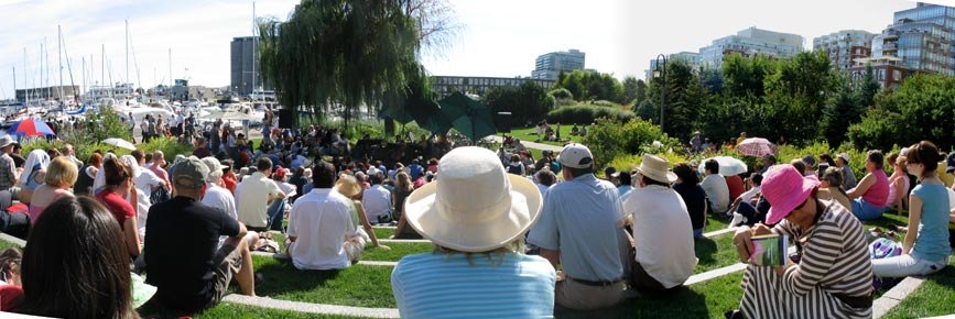
These panoramas were from a baroque music performance in the Music Garden a few weeks ago which finally (and belatedly) convinced me of the greatness of the design of the Music Garden. Apart from the glory of hearing a performance in such a wonderful space, overlooked by waterfront condos on one side and the heavy foot traffic of the waterfront promenade on the other, the wealth that such a diverse and enigmatic profusion of plants, flowers and trees brings to such a waterfront location is unimaginable. The waterfront doesn’t all have to be about loud music, plazas and intense activity – a quiet moment in a beautiful park can be part of the mix too.

music-garden_pan2_e.jpg

Junction Arts Festival

282_8270_e.JPG

The Junction Arts Festival was in full swing on the weekend on Dundas West, west of Keele. Dundas was closed to traffic from Keele to Clendenan and many of the new bars, restaurants and cafes in the area had spread out into the streets with patios, and the strong local arts community was well-represented. Dundas has a relatively narrow right-of-way, with narrow sidewalks, so like along most of Bloor, front patios are impossible normally except for businesses in corner buildings – it’s amazing when you can see what the city would be like if all the back patios were in fact out front, though short of pedestrianisation, it seems unlikely to ever happen except temporarily.

The Festival is still in its formative years but seems to get better every year and is thankfully one of the lesser-known and more relaxed of Toronto’s street festivals, some of which are starting to choke on their own success. I’m sure many of the restaurants and bars would have preferred a larger turnout, but actually being able to move through the street is a refreshing change from the press of bodies one encounters at Taste of the Danforth and some of the other street festivals.

282_8267_e.JPG282_8264_e.JPG

Beautiful Urban Moments – Part VII

282_8271_e.jpg

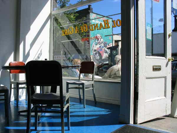
A moment of refreshment and reflection in Cool Hand of a Girl, a cafe on Dundas St W in the Junction with fair trade organic coffee (2804 Dundas W, E of Keele, opposite McBride’s motorbike shop). For a review of the cafe, see wasabi cowgirl blog here.

San Zhi Abandoned City

sanzhi_vaca_05.jpg

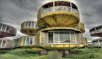
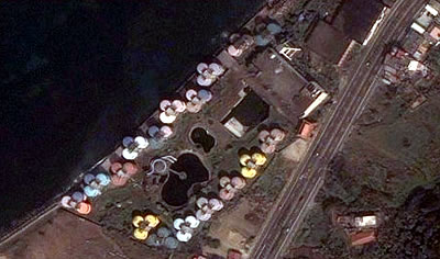
A friend sent me a link to a post about this amazing abandoned resort scheme in Taiwan outside Taipei, called San Zhi. I don’t know if I’ve ever seen a more curious and misguided scheme – but you can’t deny that the photographs are both amazing and surreal. The reasons for abandonment supposedly revolve around local stories that the site is haunted. Visit the original site for more photos and background.

sanzhi_vaca_01.jpg

Addendum (May 2010): a commenter indicates that the buildings have now been demolished to build another attempt at a resort development

Bike Lane Ideas from Paris

img_0780.jpg

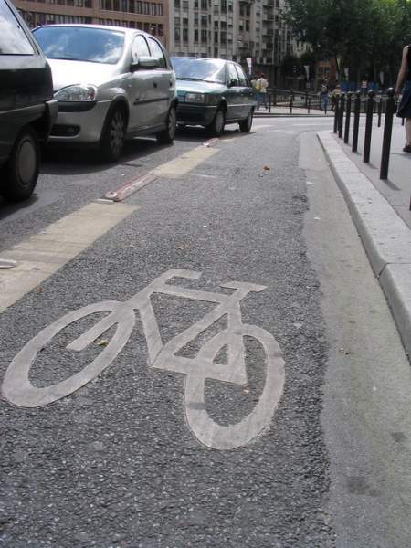
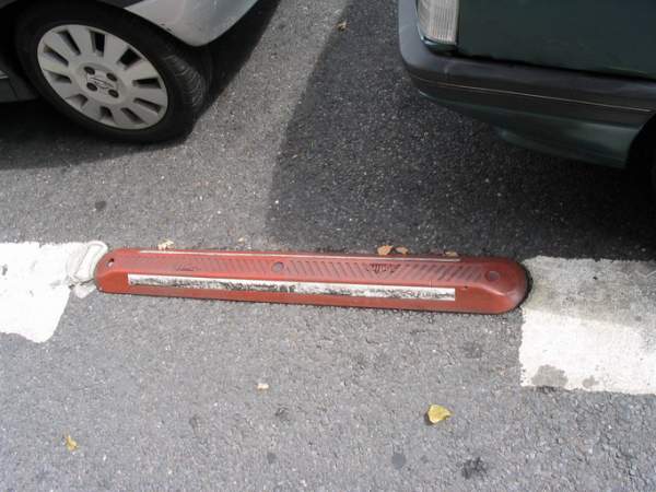
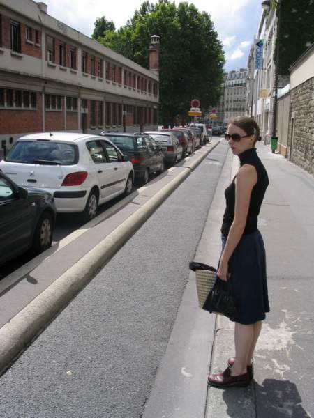
Tonto sent these bike lane examples from Paris in as a suggestion for ways to improve the way we deal with bike lanes in Toronto (this was part of his comment in response to the last post A Bike Lane Disappears… ). As he says “One solution however, to properly demarcating bike lanes, can be found in Paris. Here are some shots of possible divisions between vehicular and bicycle areas. Some work would need to be done to prevent snowplows from tearing off the strips, but I am sure there are ways around that.”

img_0781.jpgimg_0779.jpg

A Bike Lane Disappears…

282_8206_e.jpg

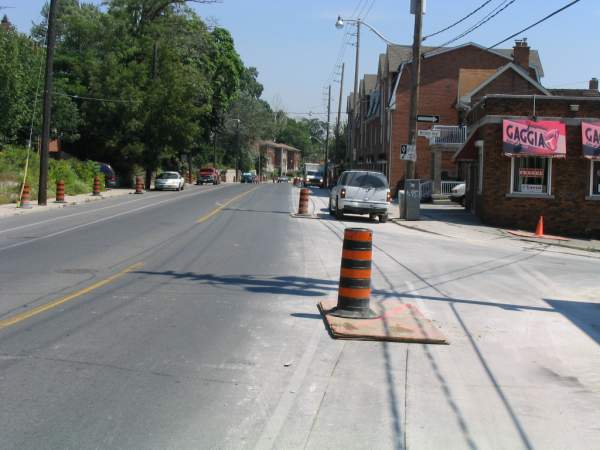
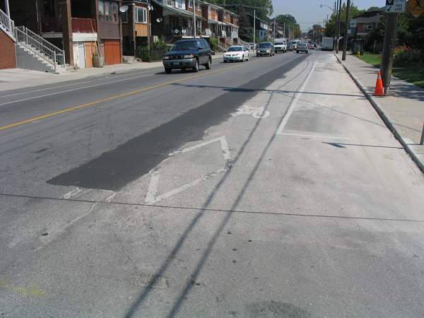
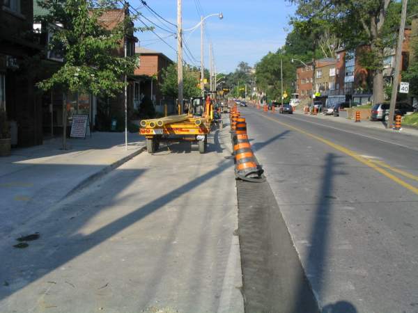
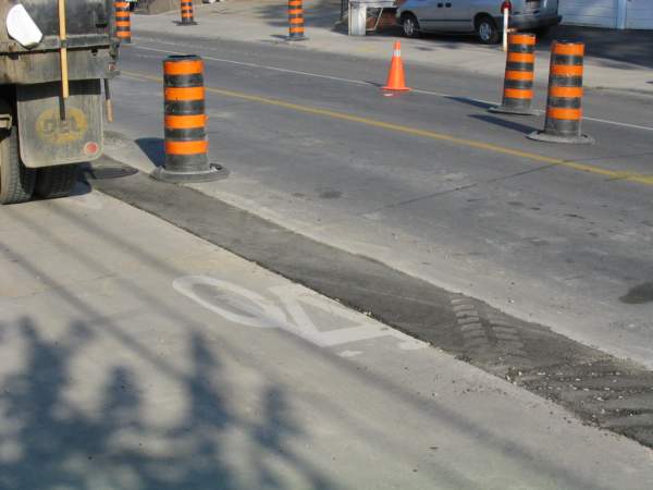
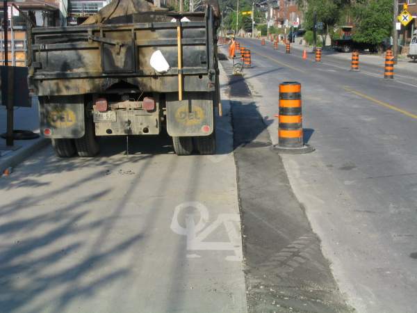
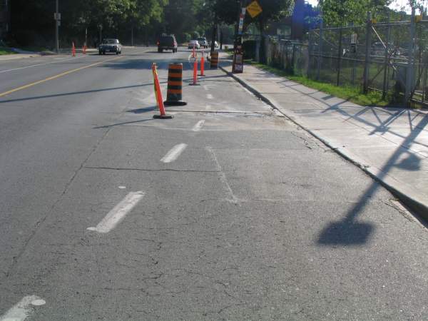
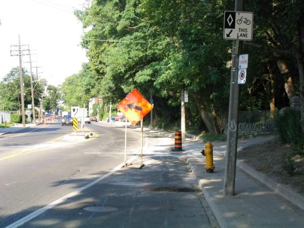
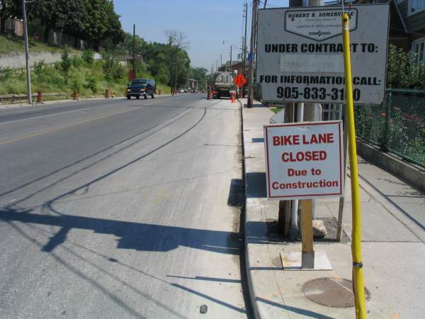
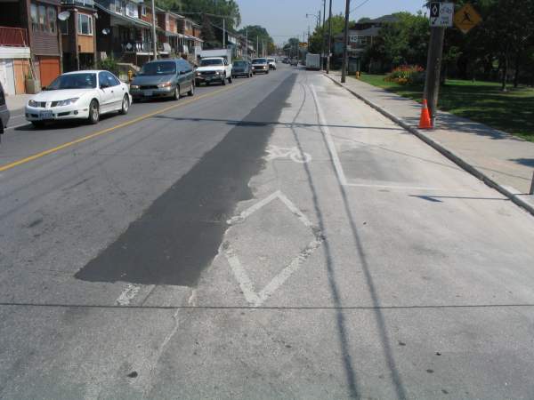
The bike lane along Davenport between Ossington and Dufferin has essentially been disappeared as a result of infrastructural work. It was bad enough while the construction was going on, but the end result has essentially been an effacement of the diamond lane markings in places, and the complete ruination of the asphalt surface of the lane in others. A recent Spacing Wire post about construction ruining existing bike lanes (see here) was pertinent as we near the frenetic end of the roadworks season.

However, I’m loath to completely blame city services or the contractors for the results – the Davenport example was obviously a quite serious replacement of a water main or some other essential infrastructure beneath the street – it’s only a shame it happened less than a year after a large part of Davenport east of Dufferin was resurfaced. Additionally, placing services anywhere else would still lead to disruption – if they were placed closer to the middle of the road, the bike lane surface wouldn’t be ruined during infrastructural work, but vehicular traffic would no doubt be diverted over the bike lane during the work itself. At any rate, there probably already is an infrastructural service under the middle of the road – in fact these days there are so many services under roads it really is a question whether it would be possible to locate them in a way that could reduce impact on bike lanes.

What is a shame is that in places the relatively fresh bike lane markings were right along the trench they dug – will they be repainting the bike lane? It hasn’t been done yet. In other places the trench is right down the middle of the bike lane and is terribly bumpy – so bumpy in fact that I’m forced to ride out in the vehicular lane. I know my cycling activist friends hate when I say it, but when I’m out there in the vehicular lane, it actually feels like I am where I belong. Call it idiocy, call it a desire for the thrills of mixed traffic, but I can’t help what I feel. That doesn’t stop me from being upset about the state of the bike lanes though.

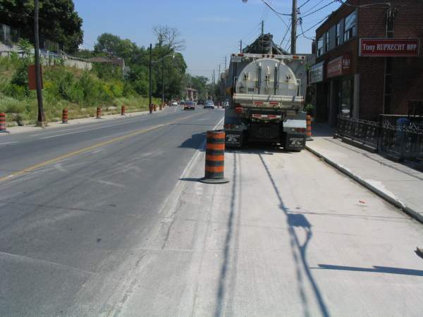
What added insult to injury was that construction affected the bike lanes all the way to Bathurst – despite minimal trench work east of Ossington – pylons and signs were placed in the bike lanes in what seemed an unnecessary way.

To me this highlights two inherent weaknesses in the way we implement bike lanes. First, simply painting bike lane markings is an invitation for them to be effaced – by weather, construction, dirt. Second, bike lanes sharing the asphalt surface with the vehicular surface (with no barrier or curb between them) is an invitation for the bike lane to be used by everyone and everything – construction crews use them for storing their vehicles and crap – taxis use them to pick up and deposit passengers – cars stand in them when they’re being the pricks that they are – delivery trucks use them as a handy place to stop without interfering with vehicular traffic – pedestrians stand in them when they’re trying to cross the road. Short of stationing a police unit on every corner of the city, enforcing the sanctity of bike lanes seems hopeless.

However, suggesting more off-road routes almost ensures that they will not be plowed and maintained in winter, and as a winter rider that is an unacceptable compromise to me.
282_8205_e.jpg
282_8207_e.jpg282_8208_e.jpg282_8204_e.jpg281_8199_e.jpg281_8200_e.jpg282_8201_e.jpg282_8202_e.jpg282_8203_e.jpg