Mapping Our Urbanism Part VI – Income
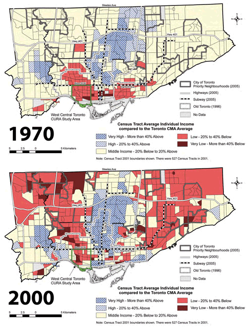
This animated map showcases the datum bookends of the excellent publication The Three Cities within Toronto: Income polarization among Toronto’s neighbourhoods, 1970–2000 by David Hulchanski from UofT‘s Centre for Urban and Community Studies (downloadable from their website). Income levels are shown as census tract averages as relative to the average for the Toronto CMA – the light pink is middle income (20% below to 20% above average), with the most interesting change occurring between that and the darker pink representing low income areas (20% to 40% below average).
The geographic explosion of lower incomes into the inner suburbs of north Etobicoke and Scarborough is almost stunning, but I think reflects a lot of our current received wisdom about the changes taking place in Toronto, in particular gentrification in old inner city neighbourhoods and the consolidation and bulwarking of high income areas. In short, it speaks volumes about housing affordability in the currently valued neighbourhoods of the city, and indicates that those who can afford to are abandoning many of the inner suburbs.
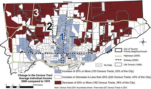
The more famous map from “The Three Cities” report is this one (above), which highlights those areas with the biggest increases (blue hatch) and decreases (dark brown) in average income between 1970 and 2000 – in this case, white areas are considered relatively stable. As you can see, looking at it this way clearly shows both gentrification at work and that the census tracts with the largest decreases in average income are almost all in the inner suburbs.
Hulchanski calls this a dramatic polarization and segregation of the city based on income, and firmly makes the point that we are capable of addressing this trend through better policies on housing affordability and requiring more affordable units in new developments to ensure that mixed income neighbourhoods are the norm instead of the exception: in his words “The segregation of the city by socio-economic status need not continue. It can be slowed and reversed.”
Crossposted to spacing toronto as part VI of a series – to view the five earlier parts follow these links:
Mapping our urbanism Part V – watersheds
Mapping our urbanism part IV – language
Mapping our urbanism part III – water mains


No Comments so far
Leave a comment
Leave a comment
Line and paragraph breaks automatic, e-mail address never displayed, HTML allowed:
<a href="" title=""> <abbr title=""> <acronym title=""> <b> <blockquote cite=""> <cite> <code> <del datetime=""> <em> <i> <q cite=""> <s> <strike> <strong>