urbanism – landscape – ideas – theory – whimsy

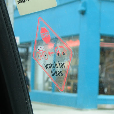
Take Cab – Watch for Bike

cab window

Not that I take cabs very often, but I happened to be in one today and noticed these cute little stickers on the inside of the rear door windows. Getting doored by passengers getting out of cabs is a drag – especially since it can easily happen on both sides of the taxi because cabs so often discharge passengers quite a ways off the curb. So the next time you take a cab, remember to watch for a bike when you’re getting in and out.

But why are you reading this? You should be watching the World Cup.

Honestly!

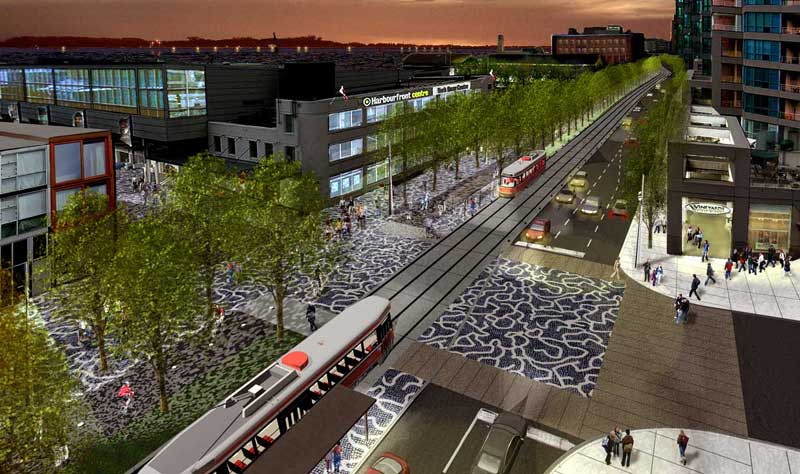
Toronto’s Future Waterfront a la West 8 / DTAH

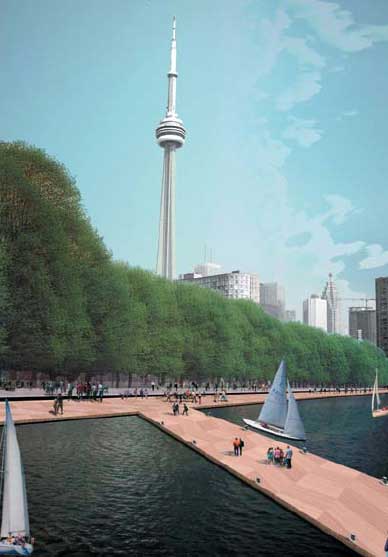
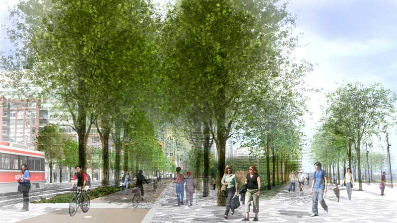
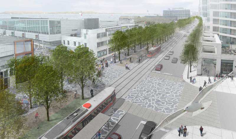
Some evocative renderings by Toronto Landscape Architecture and Urban Design firm du Toit Allsopp Hillier from the winning proposal in Toronto’s Waterfront Innovative Design Competition. Congratulations to the West 8 / DTAH team.

I reported on the result (with more images from the scheme) and set myself a-musing on its possibilities in a post yesterday. Click images to enlarge! Enjoy.

Waterfront Promenade - The Green Foot

Queen's Quay - Day View

Queen's Quay - Night View

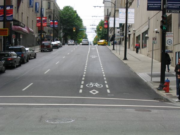
Vancouver’s Progressive Cyclism

vancouver-a

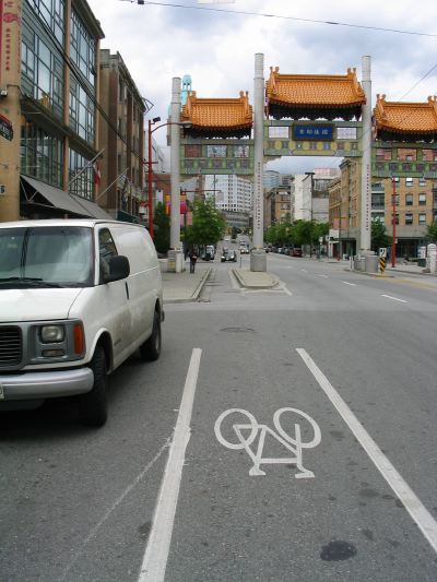
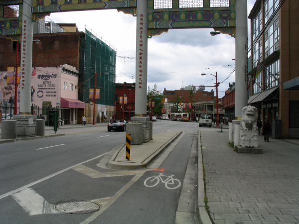
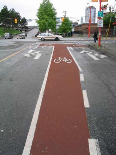
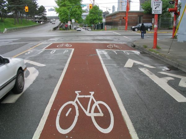
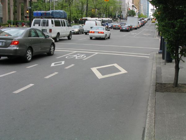
I was recently in Vancouver and noticed several fine examples of interesting approaches to bicycle lanes. I think it’s high time Toronto started experimenting a little more with alternate approaches. The only caveat to that being that many of Vancouver’s main streets are quite wide, and downtown are often one-way, so they tend to have more room to play with.

My favourites were the red/umber asphalt surfaced bicycle lane (similar to the colour used on British cycle and bus-only lanes), and the location of a separate “diamond” bicycle lane on the non-curb side of the bus/taxi “diamond” lane – an innovation any cyclist using the Bay Street “diamond” lane would appreciate, after all why should cyclists have to share their lane with some of the largest vehicles on the road (that constantly stop) and the craziest drivers (who also frequently stop)?

vancouver-b

vancouver-c

vancouver-d

vancouver-e

vancouver-f

West 8 / DTAH win Waterfront Design Competition

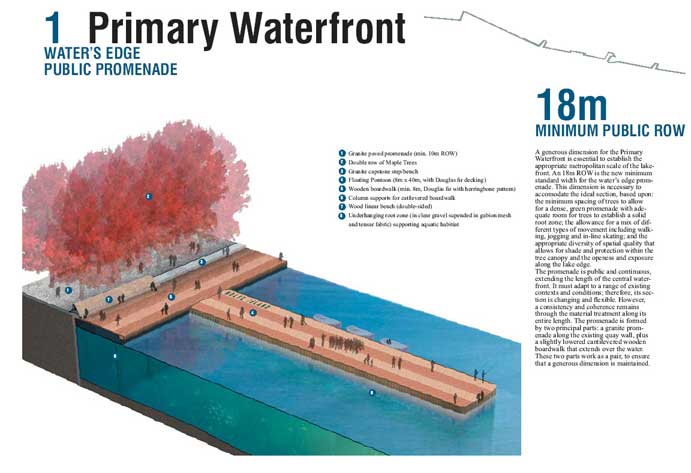
primary-waterfront.jpg

TWRC and the City today announced that the West 8 / Du Toit Allsopp Hillier team were the winners of the waterfront design competition. See TWRC and DTAH websites for details and many more images.

I think we all know the best proposal won. Let’s hope that the scheme goes through with the same principles (maybe sans giant floating maple leaf).
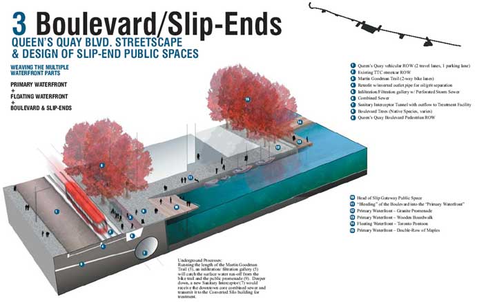
boulevard-slipends.jpg

ADDENDUM:

The winning scheme proposes the demolition of the Gardiner Expressway, to be replaced with a Champs Élysées-style boulevard, but it’s attitude towards the railway corridor (the real barrier to the waterfront) is more ambiguous. Knowing Toronto’s politics and methodology, the danger of insisting upon pinning the scheme to the demolition of the Gardiner is delaying design development or construction until agreement can be reached on the Gardiner (and that might be akin to waiting for Hell to freeze over).

Alternatively, going ahead with the Queen’s Quay, slip, and waterfront promenade work without a commitment to demolishing the Gardiner would fulfill the mandate of the competition’s terms of reference, while giving little leverage to force action on the Gardiner question. This whole issue is aggravated by the fact that the existing development along the north side of Queen’s Quay deliberately turns its back on the Gardiner (for obvious reasons), and consequently Queen’s Quay operates quite independent of the Gardiner/Lakeshore Boulevard co-dependency. It is therefore hard to practically argue that a Gardiner demolition is essential to the work on Queen’s Quay.

We’ve seen this play before – some of us might remember the euphoria that accompanied the Fung report and the release of the Making Waves Part II Plan for the Waterfront, both of which gave the impression that the Gardiner would soon be a piece of history, until the Front Street extension became TWRC’s first priority – a project that now seems to be on hold, but which is a constant threat hanging over the Gardiner’s future.

Adrian Geuze of West 8 might be blissfully unaware of the machinations of the Toronto undercurrents, but that doesn’t mean that the proposal to demolish the Gardiner is wrong. The idea of a Champs Élysées-style boulevard is in fact a huge leap forward since most other schemes have proposed a tunnel (akin to Boston’s hugely expensive Big Dig) which is tantamount to accepting the failure of the whole idea in advance.

I think the issue of the Gardiner is so divisive that I wouldn’t be surprised if it became a mayoral election issue in much the way the fixed-link to the Toronto Island Airport became the issue that galvanised David Miller’s win in the last race. There are enough drivers who adore the views and experience of driving the Gardiner (regardless of the cost to the city and the waterfront) and functional transportation thinkers who have a hard time imagining how the boulevard could make up the capacity of the Gardiner, that I would be worried to rely on a plebiscite to settle the issue.

There is the additional oddity that along the western waterfront there are three directly parallel and adjacent large roadways all making their way towards downtown – Lakeshore Boulevard (6 lanes?), the Gardiner (not raised, 6 lanes?), and the Queensway (6 lanes?). My question is, if the raised downtown section of the Gardiner was demolished and replaced with a boulevard (presumably eliminating Lakeshore Boulevard which practically runs beneath it), would that then enable removal of one or two of these western arteries which pose such an enormous barrier between the western waterfront and the city?

If the Gardiner did ever come down, I can’t think of a better reason to dramatically improve the GO train service along the waterfront corridor. Improved service and frequency in both directions throughout the day could go a long way to relieving possible congestion or increased travel times resulting from a demolition of the Gardiner. A perusal of current schedules shows that frequencies aren’t too bad – except who wants to wait an hour for a train? Running a better service might require electrification of the lines (which allows quicker stopping and acceleration after a stop and therefore increased number of stops) possibly allowing for the running of local and express lines with better travel times than the Long Branch streetcar line. An integrated GO transit – TTC fare structure / transfer privileges wouldn’t hurt either. Hey, if we can dream about demolishing the Gardiner, surely we can dream about improved transit?
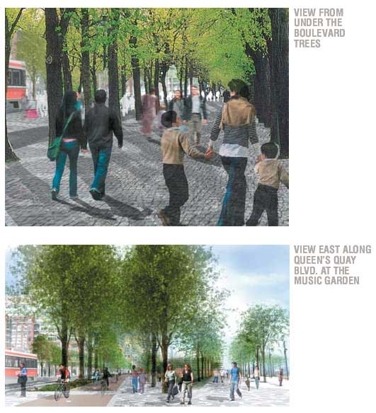
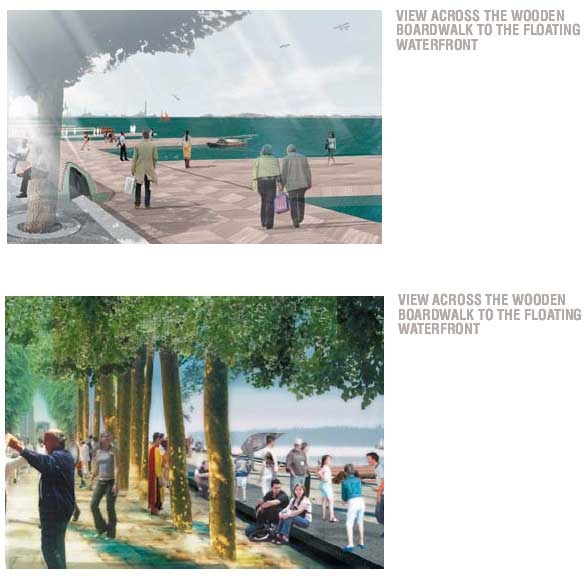
queensquay-perps.jpg

waters-edge-view.jpg

view.jpg

Beautiful Urban Moments – Part V

Dovercourt Park - Spring

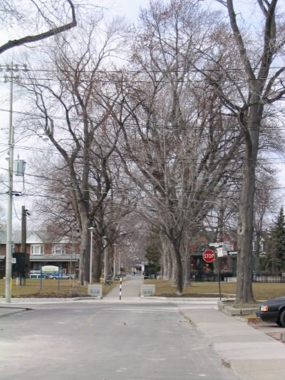
One of my favourite Toronto park moments is the allée of silver maples that cuts north-south through Dovercourt Park in the west end. The park is half-way between Dufferin Street and Dovercourt Road, and half-way beween Bloor Street West and Dupont Street. If coming along Shanly Street one block south, you look north up Salem Avenue and are treated to the allée continuing the line of the street through the park.

Apart from the lack of strong formal elements in most Toronto Parks (especially allées), this park is additionally special in that it is a park along the lines of the real English “square”. It is surrounded by small residential streets on all sides, and it is larger than most of the other Toronto “squares”. It successfully works as a whole where so many others dissolve into a collection of uncomfortable uses. The allée also brilliantly divides the park into an open field on the west side (laid out for baseball – I think unfortunately), and a series of more discreet uses on the east side, including a kids playground, a community centre, and tennis courts. If there was a wrought-iron fence around it and the baseball field was just an open field, it could almost be an English “square”.

Unfortunately, the silver maples are (as are so many of Toronto’s majestic Acer saccharinum) reaching the end of their life span. There are gaps in the allée already, and the City has started replanting the missing trees (though bizarrely, by my eye, they are not placing them along the line of the centres of the existing trees, but along their forward edge – very disappointing).

Sometimes simple spaces work best. Many of our new parks, such as the Central Park in the West Railway Lands (Concord Adex Park), or Wychwood Carbarns Park, will be so crammed full of programme, there’s no room for simple space and a grand idea. I can’t help think that we’ve lost something along the way with our busy-body urbanism.

Dovercourt Park - Winter

Ringless Bike Posts – Update

Bike Posts Re-Ringed!

I am pleased to report that the ringless bike posts along Dundas Street West east of Keele that I described last week have been re-ringed (well, a lonely two are still ringless, but it’s an improvement). It’s good to know that the City’s services are capable of working this fast when they’ve been made aware.

All credit should go to Matt Blackett over at the spacing wire who saw fit to give the orignial incident widespread exposure (see here) and then Dylan Reid who followed up with contact information to get the problem fixed (see here).

Bike Posts Re-Ringed!

By the way, the cafe opposite McBride’s Motorbike shop I mentioned in the original post is called “Cool Hand of the Girl”. Give it a try. The Agora cafe a few blocks west of Keele is also a good bet.

Beautiful Urban Moments – Part IV

Hop Scotch

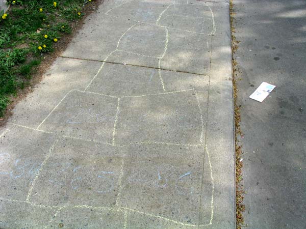
I stumbled across an energetically created hopscotch “board” on the sidewalk of Delaware Avenue north of College. The tireless kids got up past number 450 before petering out. I must say, that would be one hell of a workout to play! Unfortunately it rained briefly on Friday night and the “board” was gone by Saturday. Urban ephemera make for beautiful urban moments.

Hop Scotch2

Yup. They’re Too Big.

Too Big!

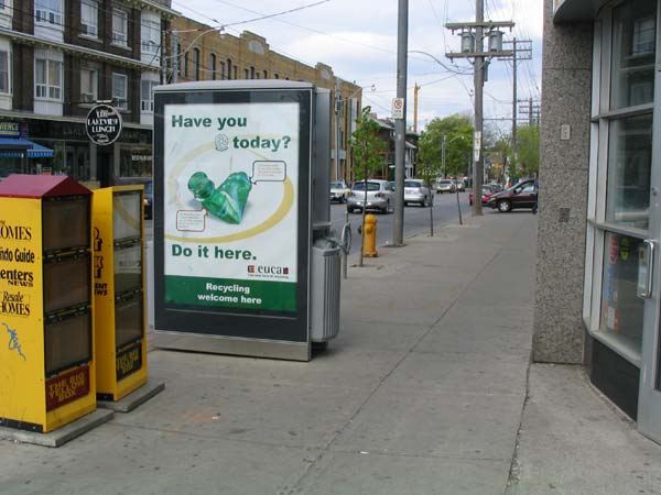
I know it’s old news. But it still boggles the mind. Toronto’s new waste and recycling receptacles are too big for the old inner city neighbourhoods. It’s rare enough to have a nice clear and wide sidewalk along many streets what with newspaper boxes, advertising sandwich boards, tree planters and all the rest of the streetscape paraphenalia. The last thing we need is a giant perpendicular garbage billboard taking up half of a sidewalk. Just look at the photo (taken at the corner of Ossington and Dundas) – it is actually taking up half the sidewalk!

And as for revenue, in the receptacle in this picture both sides have ads advocating recycling which I sincerely hope the City didn’t have to pay for – but of course, since this network of multi-tasking billboards are run for profit, you can bet those recycling ads won’t last for long.

I like to think that these abominations won’t either.

Edit: the spacing wire just answered my question (see here).

The Curious Incident of the Missing Bike Rings

IMG_7213_e.jpg

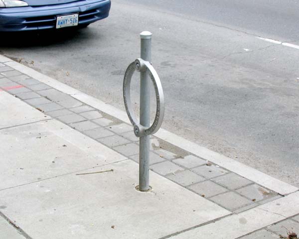
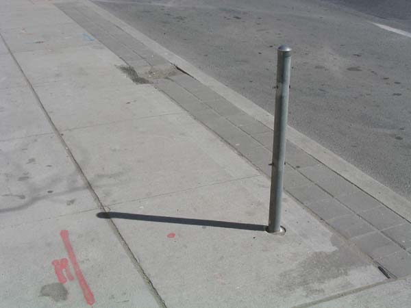
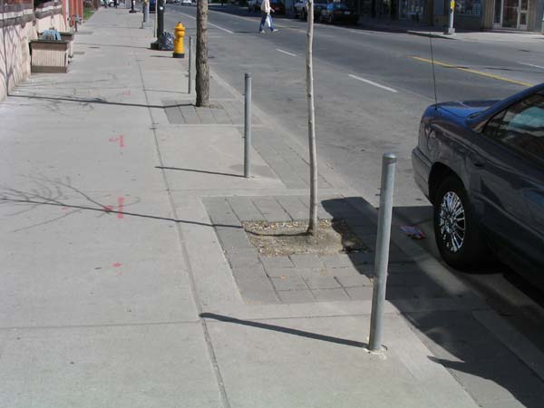
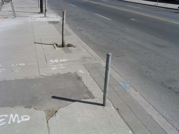
There’s a whole stretch of Dundas Street West, east of Keele Street, where all the Bicycle posts have lost their rings. It’s quite curious. Have they been stolen? Is it vandalism? Is there an official reason behind it? With summer fast approaching and fairweather cyclists snapping up all the available lock-up space, I don’t like to see unusable bike posts.

IMG_7212_e.jpg
IMG_7215_e.jpg

And here we have the ultimate combination – the ringless bike post next to the cut off stump of a poor little failed street tree. Toronto’s uplifting streetscape in the flesh!

FYI – there’s a cool new coffee shop with excellent fair trade organic coffee right around here – just across the street from McBride’s motorcycle shop (before you grimace, let me tell you it was $1.50 and was a great cup of coffee – organic milk and cream as well). As a matter of fact, the whole area’s hopping these days. Having grown up in the Junction, I’m pretty happy with the way things are going.

While you’re in the area check out Pandemonium, a great used book shop at Keele and Dundas – or if you can make it further west, the refined The Book Exchange stocks only very good condition used books – but don’t go by their website, it’s the pits.

Changes, changes….

I’m giving WordPress a try – it might take a bit for me to get things back in order around here.

And sorry if a link to a post has changed – they should all be here somewhere or other…. I’ve still left the original up at their locations for now, but they’re all duplicated in the new structure.

Please also note the Site Feed has changed – with WordPress it’s now RSS not Atom and the address (see sidebar) is https://www.bricoleurbanism.org/feed/ – I’m not actually sure it’s working properly, so if anyone’s having problems with it let me know via my contact form.