A Little Request of the TTC
OK. I’m a little behind the times. It’s been months since the TTC started installing media video screens on the subway platforms showing CP24 and advertising, but I’m only now getting around to a response.
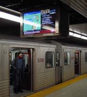
First of all, I don’t know what the fuss is all about. The Public Space Committee and their ilk are having a fit over all this – and maybe TV is getting all-pervasive with CP24 being broadcast on a giant media screen at Yonge and Bloor and too many to count at Dundas and Yonge – but the fact is, I don’t mind having access to those scrolling news reports, and given the length of a subway platform, the size of the subway screens is easy enough to ignore if you’re not interested. And despite what the TPSC and Spacing seem interested in perpetuating, I don’t find the “design” of Toronto’s subway stations (downtown) to be wonderfully stimulating simply because they bothered to change the colour of the tiles in each station. Frankly the stations look, feel, and sometimes smell like a not-very-well-cared-for public convenience. Bring on the advertising! It’s the only thing to read on the subway when I don’t have a book or newspaper or it’s rush hour and there’s not enough room to get one out.
Some of these people seem convinced that advertising is somehow impacting the sociability of people on the subway. I don’t think these people can possibly ride the subway every day – in a WASPish society, social interaction doesn’t tend to happen on the subway unless you already know the person – that’s just not the way we are. Staring at walls and avoiding eye contact is what we do – advertising or no advertising. And while Toronto is far more diverse than being mono-WASPish, I think many of the other cultures here adopt the dominant social convention when it comes to things like subway culture. Want proof? Just ride the subway.
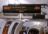
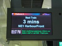
But I digress. That’s not the point. What I cannot understand is how the TTC has not required that these new video screens display the wait time for the next train the way it is done in innumerable other cities. More to the point – how can a first-class subway system like the TTC’s not afford to have their own information system for the next train? Now it might seem pointless to do so for Toronto’s simple subway system – with only 2 lines, basically all trains going to the end of the lines, and trains supposed to be never more than every 5 minutes, why would you need to know when the next train is? To me it’s simply a question of passenger appreciation – it’s always nice to know how long the wait will be because sometimes something happens and the train won’t be coming in 5 minutes. You reduce passenger anger and frustration by letting us know when the next train will be – if the first train is full and I know the second one is only 2 minutes behind it, I won’t feel so bad waiting for it.
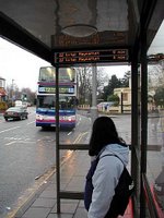
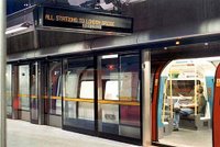
Back in July, Howard Moscoe, City councillor and chair of the Transit Commission, publicised an idea to provide electronic information screens for bus stops in suburban parts of the city. While I support this idea – (but hey let’s start with streetcar lines and frequent service routes since those are the ones without a detailed schedule – most suburban routes stick to a pretty strict, timed schedule that can be posted in print at stops) in almost every other city I can think of that has these bus information systems, they did it first on their subway system. On the Spacing Wire story, the picture they use isn’t even from a bus shelter – it’s from the Jubilee line in London (Stanmore is the northern terminus). In so many other places such as London, Paris, Rotterdam, Singapore – they believe it is worthwhile to tell passengers when the next train will be. There are far fewer subway stations than bus stops, and they already have to know exactly where every subway train is for safety purposes, so for a starter project, why is it so hard – especially when they’re replacing information screens on the subway already?
But, while I’m on this topic – let’s talk about the other side of subway communications – announcing the current station and the next station. The TTC has been beefing up its vigilance in requiring subway operators to call out the next stop and the station when they’re pulling into it. However, I was recently moved to write this article after a week of horrible rides culminating in a terrible operator announcing each station with an Eyore-like death and doom voice that for me made the act of riding the subway a tightrope walk of seasonal depression. Not to mention other times when mumbled station names were inaudible, when stations were incorrectly called, and when the mic seemed to cut out just before the station was called – “the next station is ——-“.
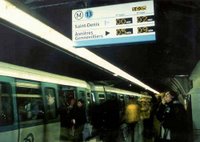
In many other city’s subways, such as some lines in London, all Singapore lines and on the Vancouver Skytrain, station names are called out with an automated system using a pre-recorded soothing but audible voice – almost always a woman’s – clearly announcing the stops. I don’t think this is space-age technology! Please, oh please can they start using a system like this on Toronto’s subway! I do already know all the stops – but sometimes when the car is full you can’t quite see the station name or remember what colour tiles your station happens to be (especially if you’re not on a trip you do every day). If the TTC already cares enough to require their operators to call out the stops all day long, can they please see the reason in installing an automated system?
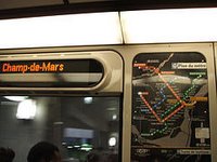
As an aside – LED displays of the current station and next station are an on-board feature of many of these same systems – giving a visual clue for those who haven’t heard or understood the audible announcement. In many other cities, they even have such displays on buses, let alone subways. A few years ago when the TTC started receiving delivery of their new subway cars, I was shocked to find that apart from being shiny steel and having red seat covers instead of orange and brown, the only real improvement over the old cars (which must have been at least 20 years old) was wider doors. There were no other technology or passenger features that made the subway-riding experience better. How many years will we have to wait now until some more sophisticated rolling stock is delivered? I prefer not to think about it. All I can say is I’m glad the TTC decided to forestall their replacement of the streetcar fleet in favour of refurbishment since I’m sure all they would have done is reorder the exact same streetcars.
No innovation here. Given the TTC’s budgetary restraints I’m not sure I blame them, but I think it’s awful that they’re not even bothering to try to leverage advertising space for improved passenger information systems. Come to think of it – Toronto sucks at that in general – take the garbage can fiasco as an example.
In 2002 we completed the ridiculous Sheppard Subway line at a cost of $934 million and yet the TTC did not implement any of these passenger information system initiatives – let alone some of the other passenger experience improvements of other systems such as glass walled automated platform barrier/doors that make it impossible for someone to be pushed into the tracks, stop the wind from rushing through stations, and look HOT. While I know that transit financing in Canada is so tied to politics that understanding the logic behind any of the decisions is pointless, it still bothers me that $934 million can be spent on a subway to nowhere, but nothing can be found to help improve the experience on the existing system, nor a couple of million dollars extra (on a pricetag of $934 million) to pilot a new information technology on a new line.
All I can say is, it’s sad. But in case you think it’s impossible in Toronto, go and check out York Region’s fancy new Viva rapid tranist bus system. Not only do the bus stops have displays showing how long until the next bus, but there are on-board displays showing next stop and time to next stop. Hello future.




3 Comments so far
Leave a comment
Very nice post. As the publisher of Spacing, the only thing I really disagree with re: video monitors is that advertising seems to be the dominant feature of the video screens, not the arrival times or delays. If half the screen was dedicated to the TTC info it would have been a lot more paletable. Advertising has a place in our society, but too often in the city if becomes a dominant force — the design of our infrastructure should be dictated by our needs first and advertising/marketing second. But that never seems to be the case, which is where we have our problems. Bus shelters are fine cuz ads are just added on, not the main focus.
Thanks for the indepth post.
By Matt B on 01.17.06 11:49 am
As a person close to the screens, thanks for the ballenced approach. Truth is, they are working on having next train information- the old technology of the TTC is the challenge, not the company running the system. Look for it in the next few months.
I think these guys are trying to present a utilitarian approach to the difficulties of the city… it’s going broke and somebody’s trying to upgrade it on their own dime. More work like this, and we wouldn’t be 500 million in the hole this year!
– Screen Lover
By Anonymous on 02.16.06 10:09 pm
[…] is one of modern cities in Asia which boasts an efficient subway train system. In the past 10 years alone, there had been a number of expansions which was made to its subway […]
By Laugh Makes Fun | All about Leisure Time on 06.07.12 7:24 pm
Leave a comment
Line and paragraph breaks automatic, e-mail address never displayed, HTML allowed:
<a href="" title=""> <abbr title=""> <acronym title=""> <b> <blockquote cite=""> <cite> <code> <del datetime=""> <em> <i> <q cite=""> <s> <strike> <strong>