ROM Crystal Architectural Opening

Photo: Textile & Costume Gallery, 4th floor
Finally made it into the ROM’s new Crystal by Daniel Libeskind as part of the museum extension’s grand architectural opening. The building is being shown empty to give an opportunity to appreciate the architecture itself, though it looks like that should be quite easy even once exhibits are in. It’s a building with a large number of quirks, odd corners, strange views and peepholes, extreme awkwardness, and near sublime austerity – and though it’s very photogenic (it’s hard not to take an interesting photo inside), right now it’s very hard to love.
It’s new, it’s weird, it’s eerily fascinating. But there are a few moments that seem to fail the visitor so miserably, that love is not a word that can be associated with this building. The new main entrance is an awkward angled slot off Bloor, and when you do get inside, prepare to be literally underwhelmed – the first impression is awful. Move through to the Gloria Chen Court and you finally get to experience some of the grand spaciousness one would expect of a great museum – however this court doesn’t feel like it leads anywhere now that the Samuel Hall is basically just a lounge, nor does it seem to perform any understandable purpose (for example, aiding in spatial coherence).
Having said all that, the galleries themselves are fun and weird – but who would actually want to fill them up with exhibits? And there lies the central problem of such architectural grandstanding for an institution such as the ROM – what does it have to do with the ROM, its purpose, and the gallery content that will eventually fill these spaces?

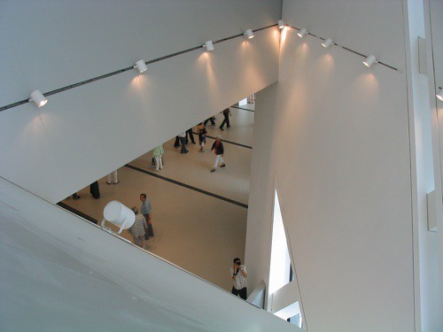
Photo: Looking down from 3rd floor

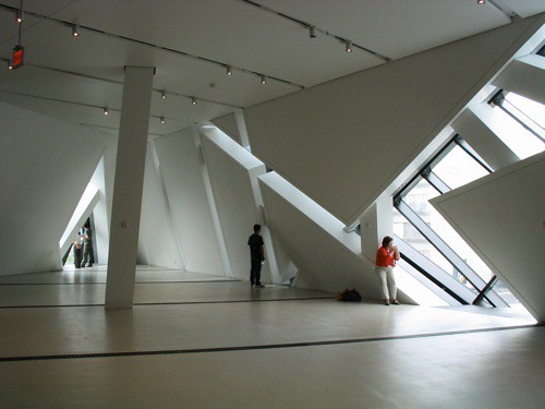
Photo: Middle East/South Asian gallery, 3rd floor

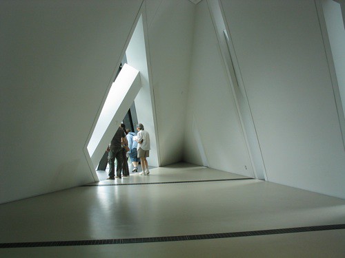
Photo: Africa, Americas & Asia Pacific gallery?, 3rd floor

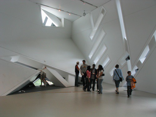
Photo: Dinosaur gallery, 2nd floor

Photo: Dinosaur gallery, 2nd floor
Despite the Crystal being so photogenic, without exhibits in its halls it is strangely barren, uninviting, cold and austere – as a result it is hard to feel very comfortable in any part of the new building – in fact, one gets the impression that we’re not meant to feel remotely comfortable. The most comfortable (and welcome) new addition is actually the wonderful new Food Studio cafeteria in the basement – a vast improvement over the previous cafeteria iterations and a comforting and naturally-lit space (and no, barely an odd angle in sight).
If it’s comfort you want, a foray into the original building will remind you of an architecture that is about more than simply a form – a walk up the original grand staircase with its skylight and huge 4-storey-high totem poles will show up the new stair’s gimicky angular forms. To stare up into the mosaic of the vault above the Eaton Court will remind you of what the museum is supposed to be all about – there it is written (slightly archaically): “That all men may know His work”. And no, the He of His does not refer to Daniel Libeskind.
More photos in our Flickr set.

Photo: Food Studio cafeteria, basment

4 Comments so far
Leave a comment
Nice commentary Brico, and a great whammy at the end. Poor Liebeskind. Oh well. Take comfort from Schopenhauer: all geniuses are misunderstood in their own time.
My favourite shot is the one of the cafeteria. And they said you can’t find a 90 degree angle in the place! You sure proved them wrong.
By Blobby on 06.04.07 10:13 pm
Hm. I see your point, but I still love it. It’s what I call “apocalyptic” and I think Toronto needs a bit of that (and I don’t mean those Spadina-Bloor apartment buildings put up in the 80s). Besides, I got a bird’s eye view of it from Robarts yesterday, and now I’m in love.
By Chapati Kid on 06.06.07 8:42 am
Here’s my non-professional take on the interior. I had to see it to believe it. And while I can’t argue that it is sometimes underwhelming, I think on the whole, that it’s marvellous.
http://chapatikid.blogspot.com/2007/06/spaceship-has-landed.html
By The Chapati Kid on 06.06.07 6:44 pm
[…] the sequence of interior spaces, the remarkable surprises and mysteries, the nuances of refracted light, the sensitivity of the […]
By the ALLDERBLOB » Blog Archive » Tooker Gomberg at the ROM on 06.15.07 11:01 am
Leave a comment
Line and paragraph breaks automatic, e-mail address never displayed, HTML allowed:
<a href="" title=""> <abbr title=""> <acronym title=""> <b> <blockquote cite=""> <cite> <code> <del datetime=""> <em> <i> <q cite=""> <s> <strike> <strong>